01 — Context
Production design
at OEM scale
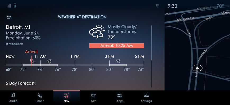
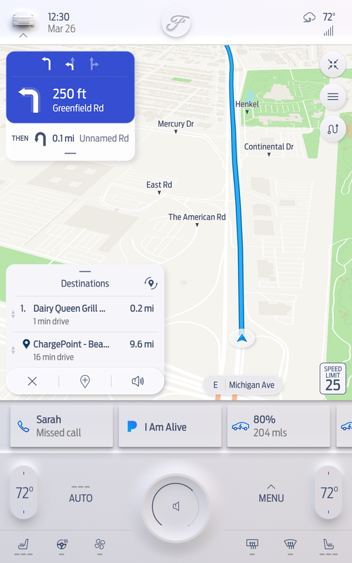
This project started with an 8" head unit display for Ford's Sync 3 system. By the time I joined, the 8" had to be adapted to 12" for the F-150 — and from there it kept growing. 12" became 13.2" for the F-150, Lincoln, and Cadillac. Then a 15" Mustang proposal. Each size brought a different aspect ratio, different Ford-mandated constraints, and for each new OEM a completely different visual language.
Ford's own style guide arrived in limited, sometimes vague form. The work was to take those constraints and build a complete UI system from them — day and night mode component libraries, full navigation screen sets, and every edge case in between. Then do it again when the brief changed.
The pace was real. "We need this redesigned in two weeks" with hundreds of existing screens is not a hypothetical — it happened. Multiple times. The job was to move fast without losing quality or consistency, across a system too large to hold in your head.
Multiple screen sizes. Two OEMs. Three languages. Day and night modes. Hundreds of production screens — redesigned under real deadlines.
02 — My Role
What the work
actually involved
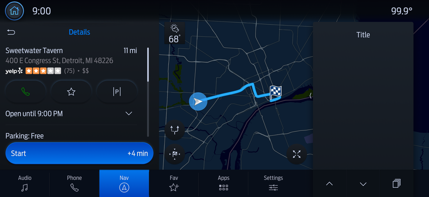
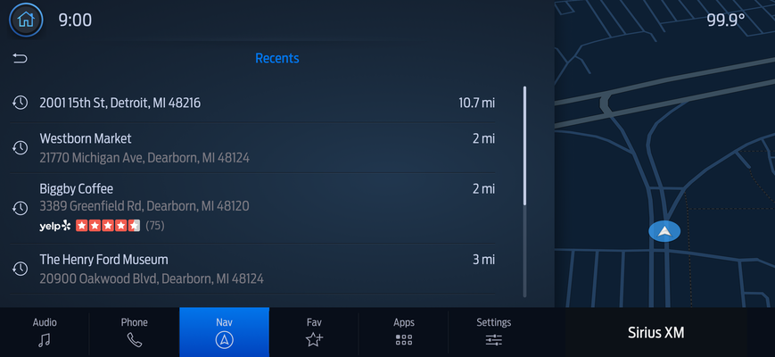
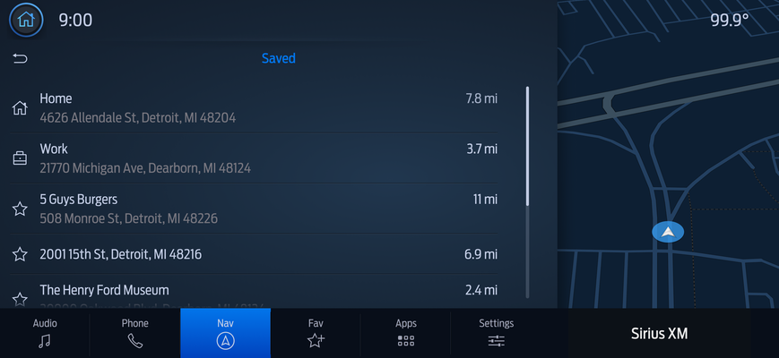
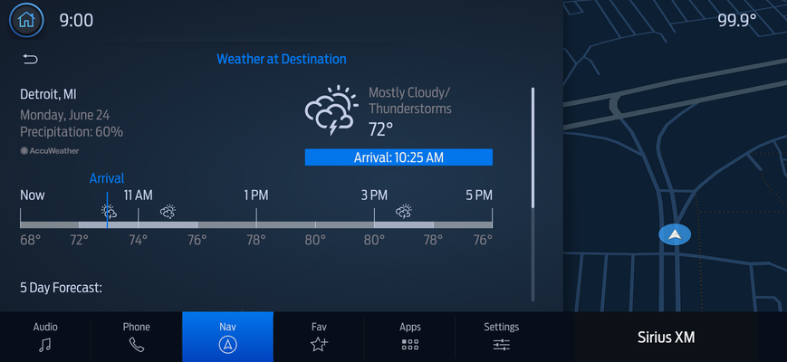
- Built day and night mode component libraries from Ford's style guide
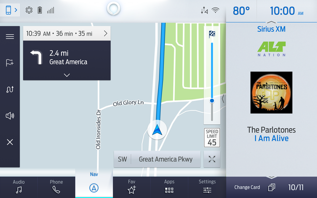
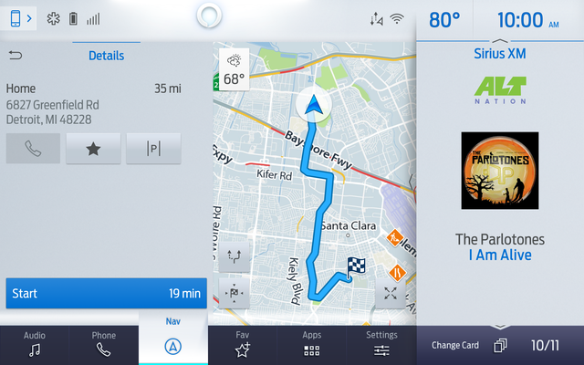
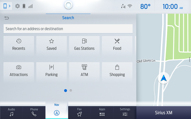
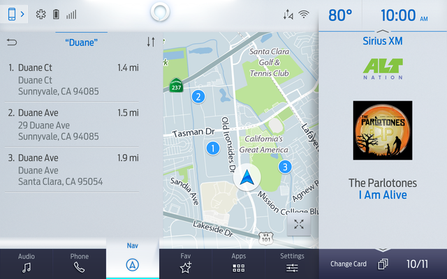
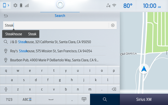
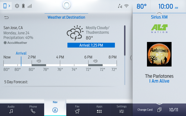
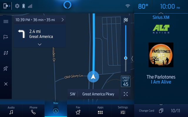
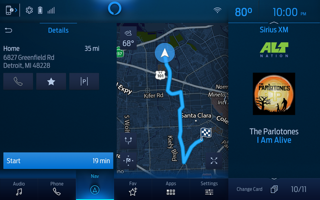
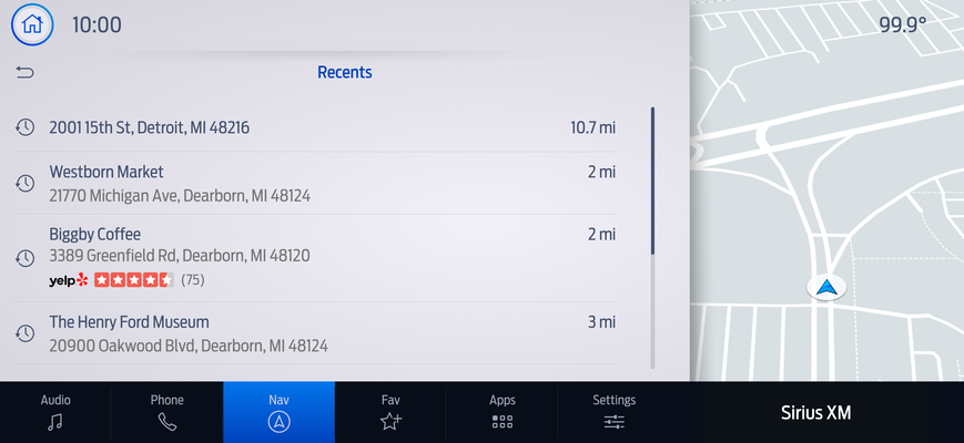
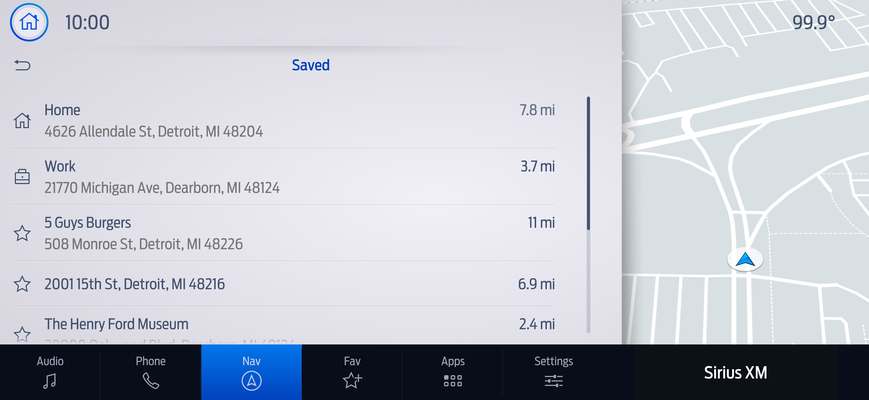
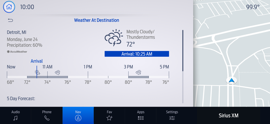
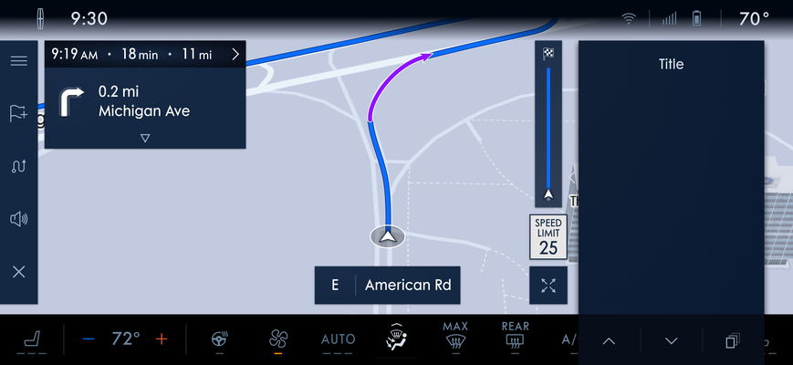
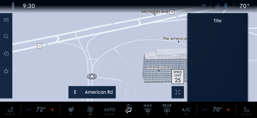
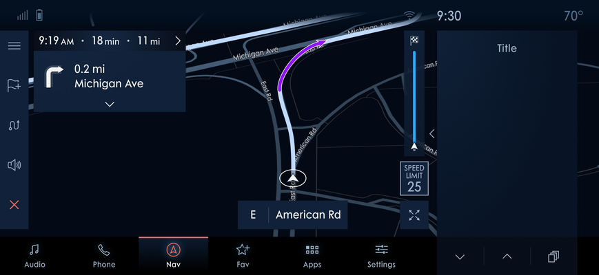
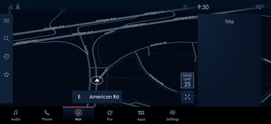
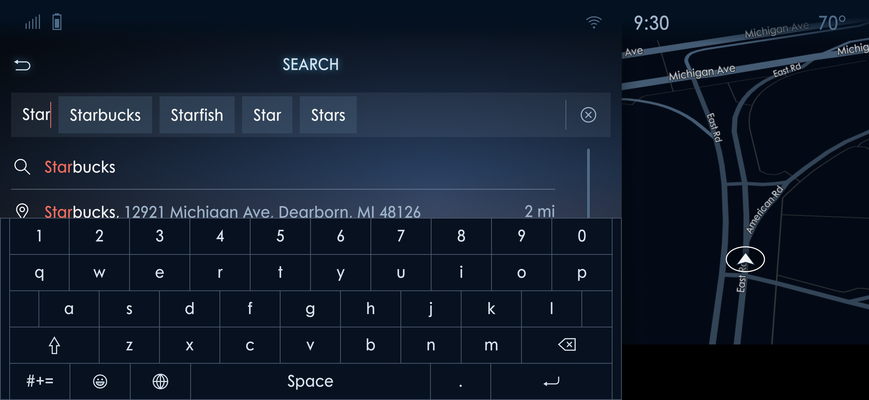
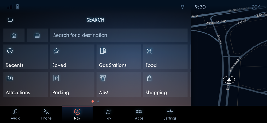
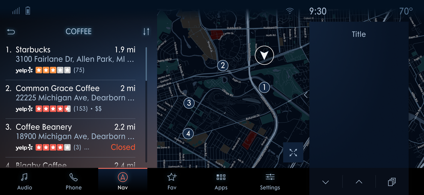
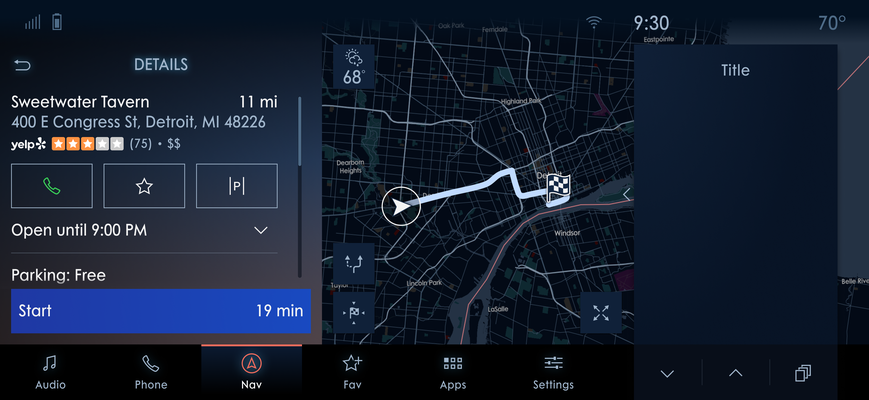
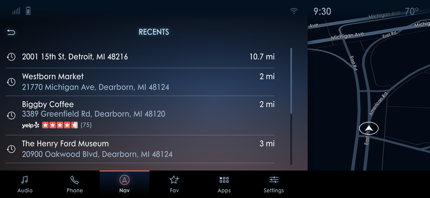
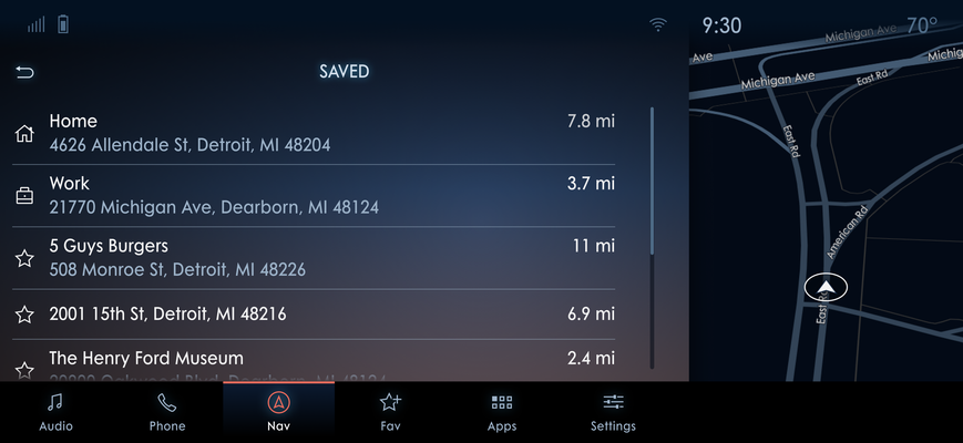
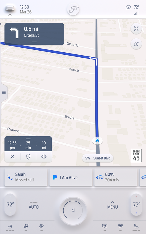
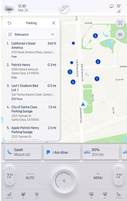
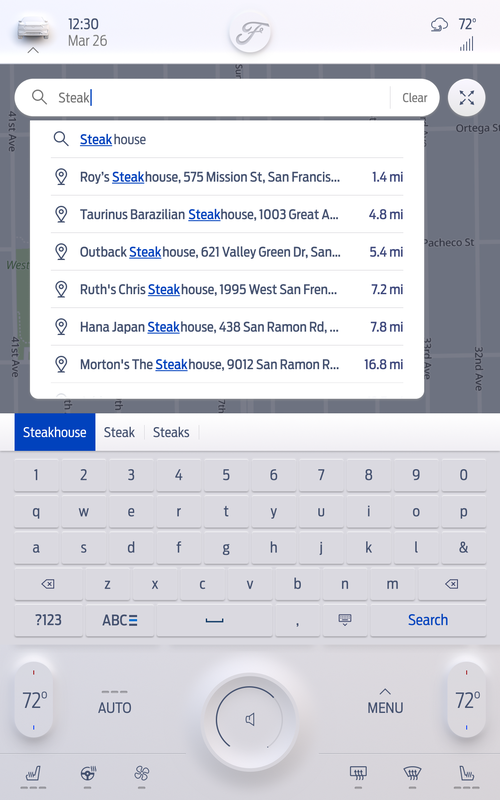
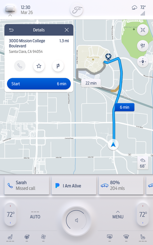
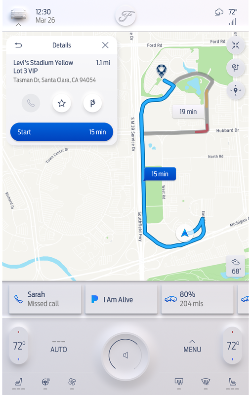
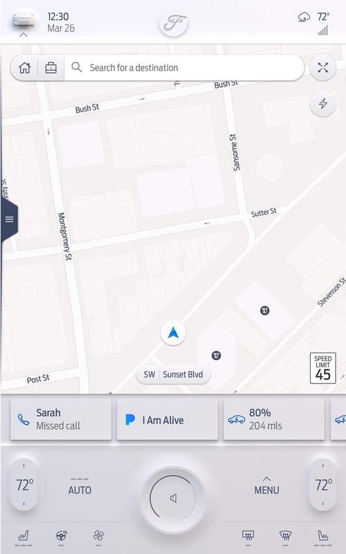
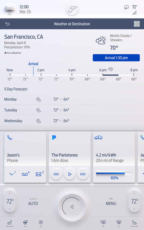
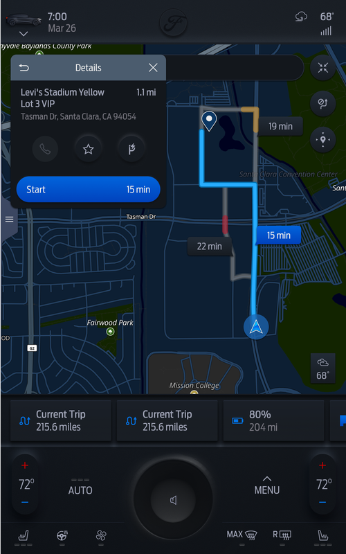
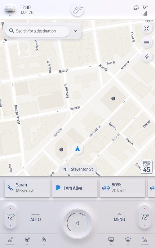
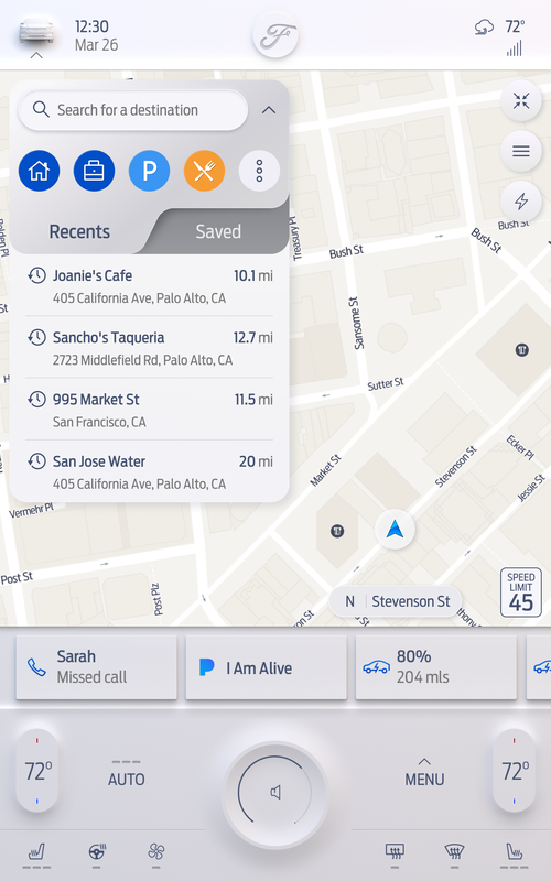
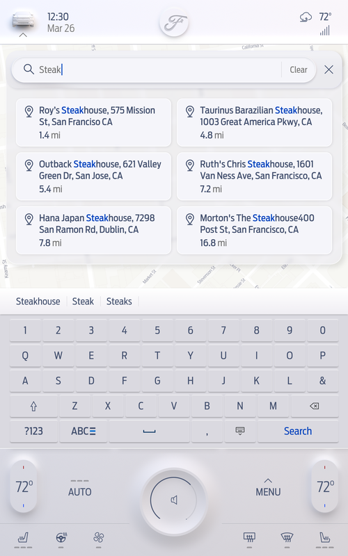
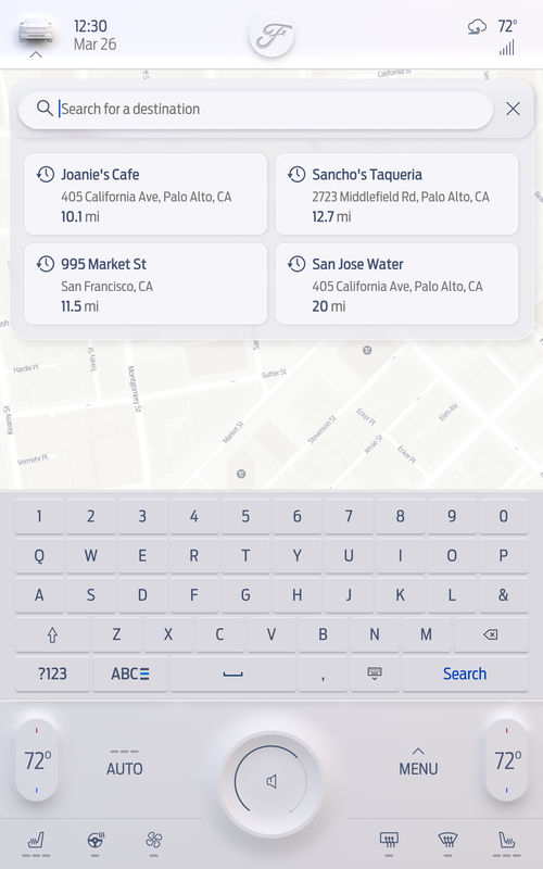
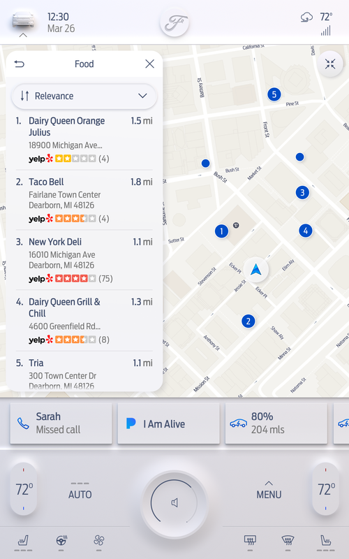
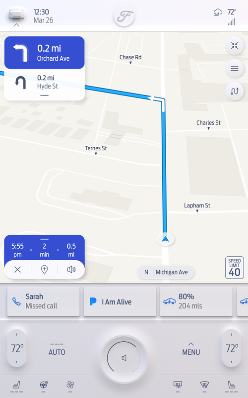
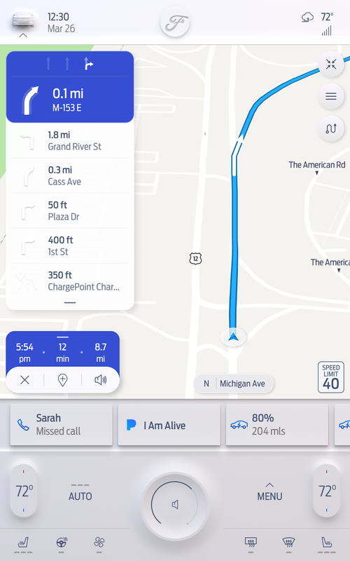
- Designed all navigation screens across 8", 12", 13.2", and 15" formats
- Adapted layouts for Lincoln and Cadillac — different fonts, colors, and visual treatments on the same underlying system
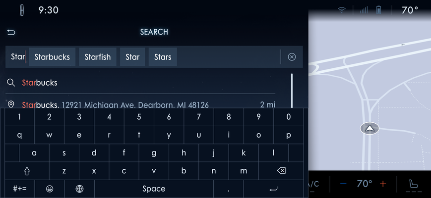
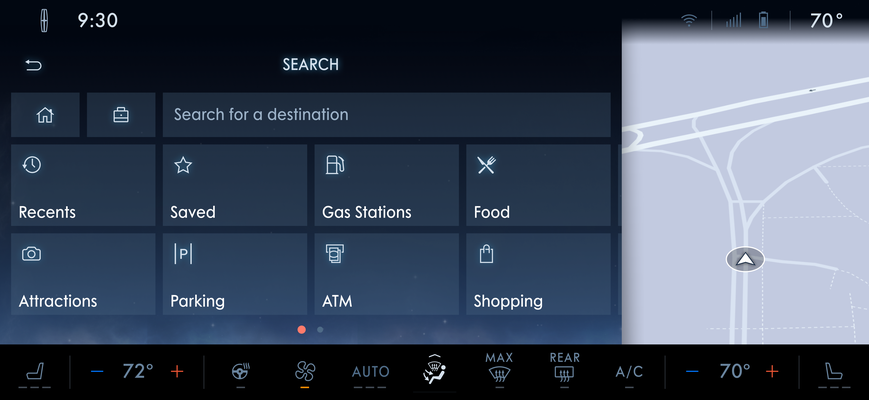
- Ensured every design worked across English, French, and Spanish
- Migrated the entire design system from Sketch + Zeplin to Figma
- Delivered production-ready specs and assets to engineering
- Redesigned the full 15" system as a proposal under extreme deadline pressure
The constraint that shaped everything was Ford's own standards — minimum font sizes and tap target sizes stricter than NHTSA requirements. Every layout decision had to work within those rules first, then be visually refined within whatever space remained.
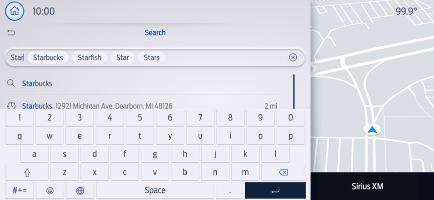
Three languages meant no layout could be designed tight in English and assumed to hold. French and Spanish labels are consistently longer — navigation instructions especially. Testing every screen in all three languages wasn't optional.
03 — Constraints
What shaped
every decision
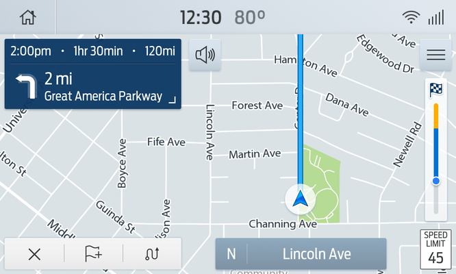
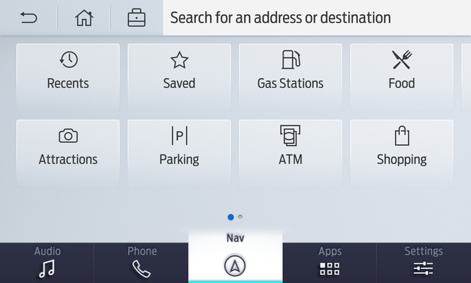
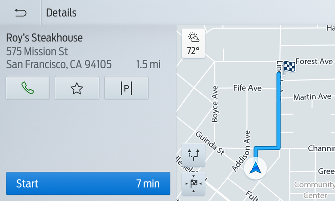
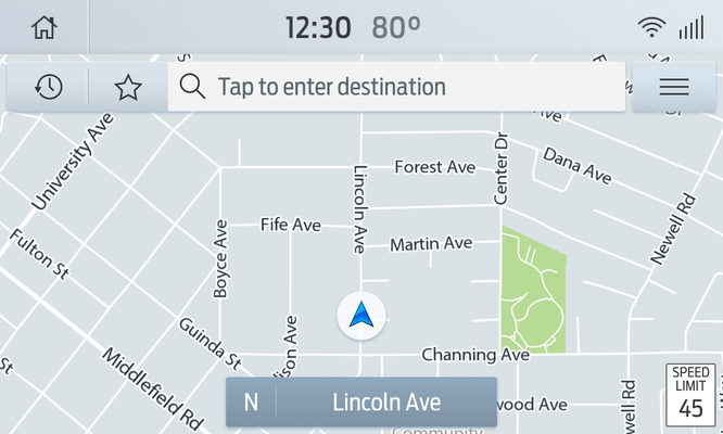
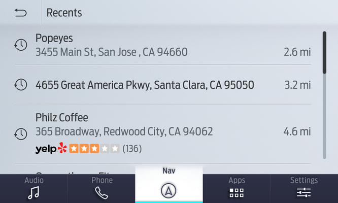
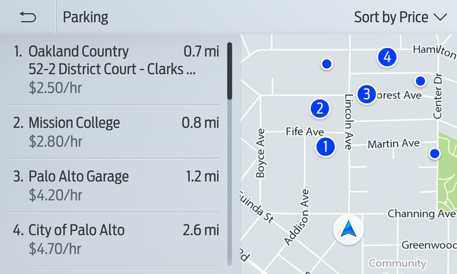
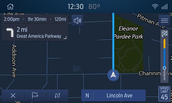
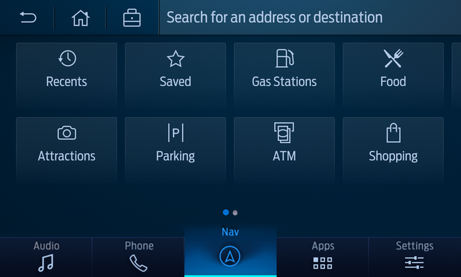
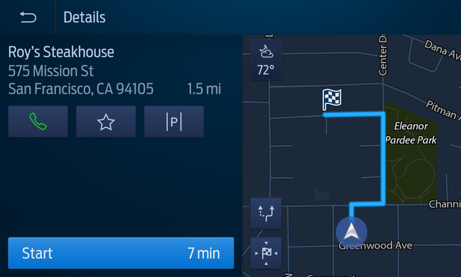
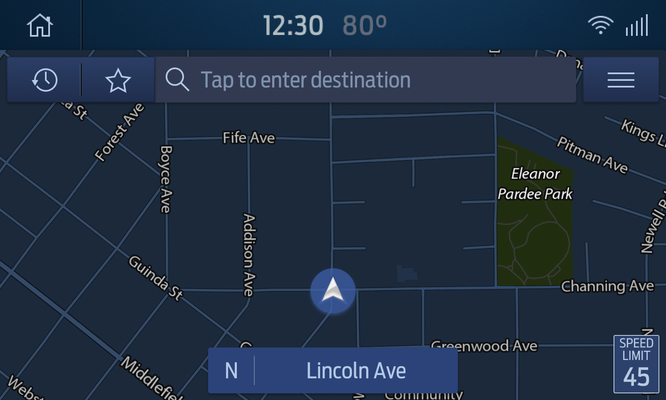
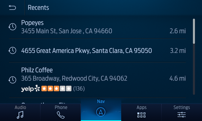
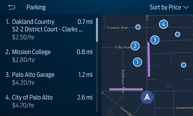
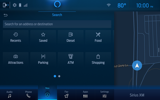
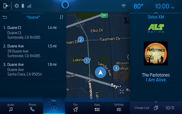
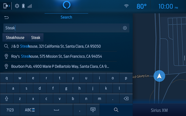
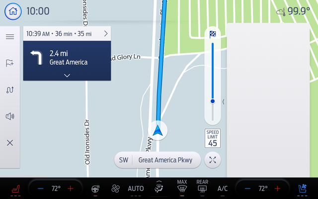
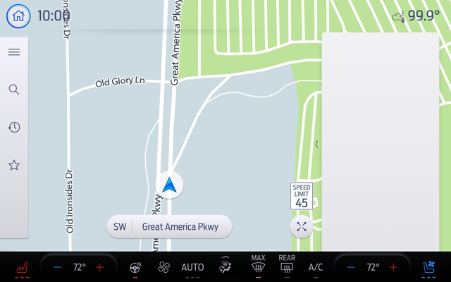
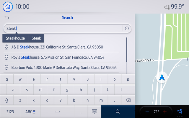
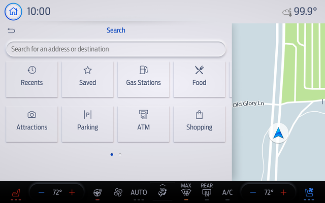
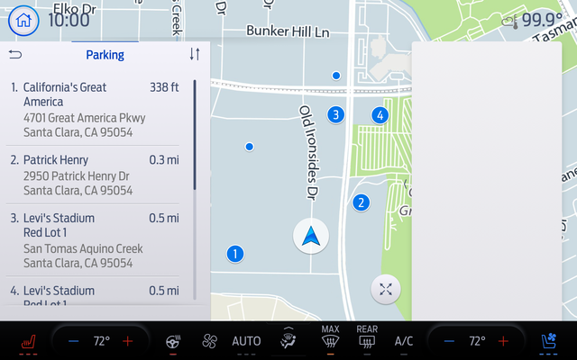
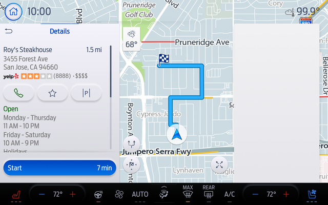
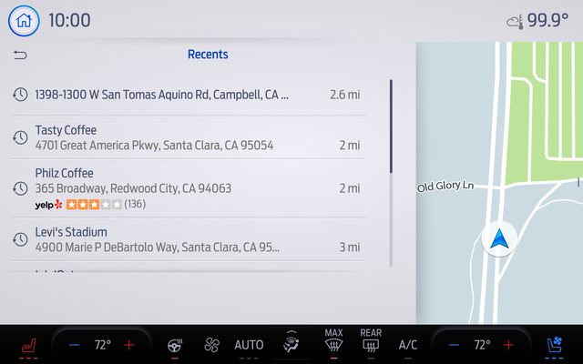
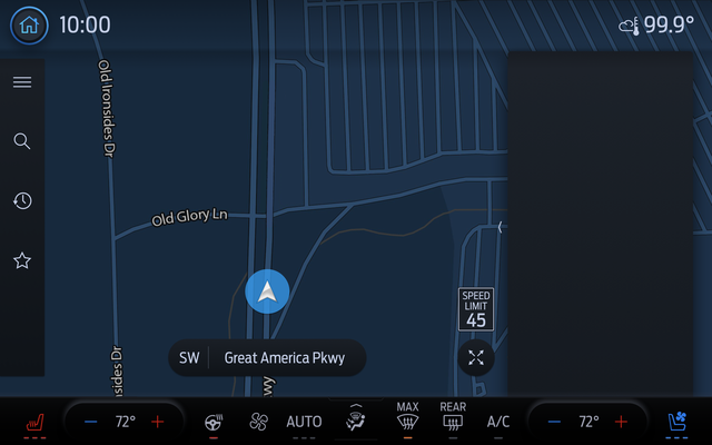
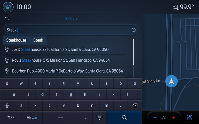
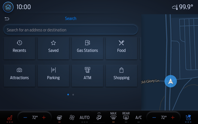
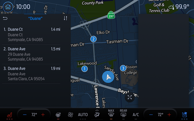
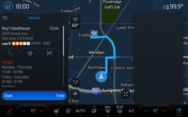
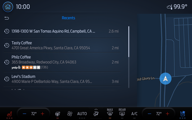
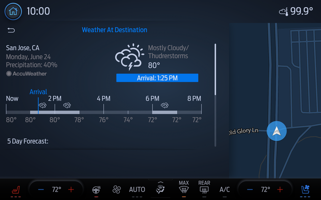
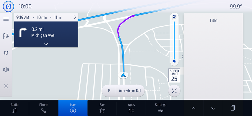
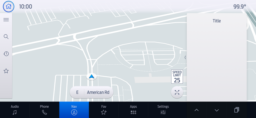
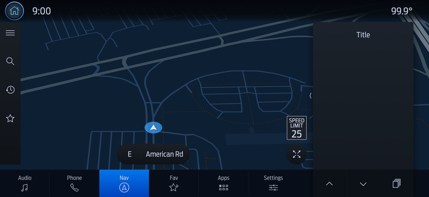
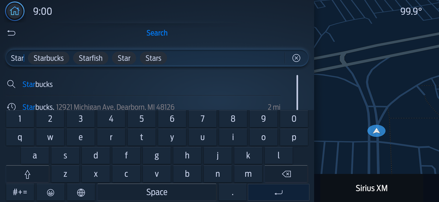
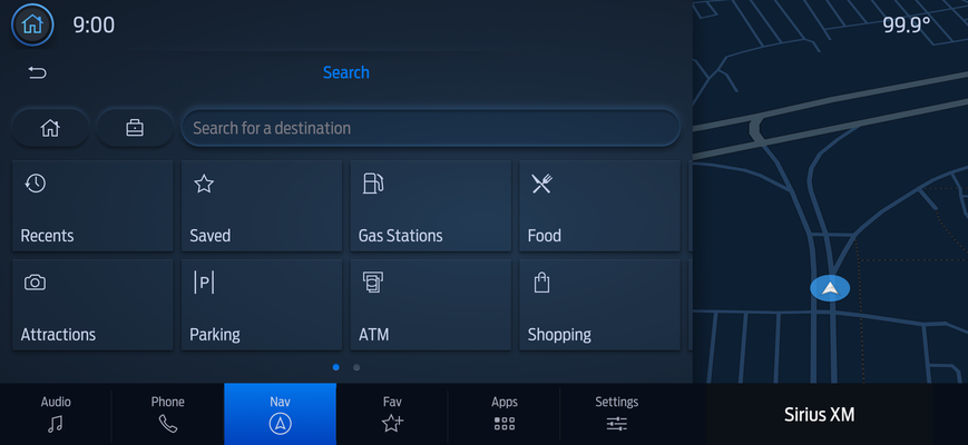
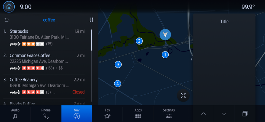
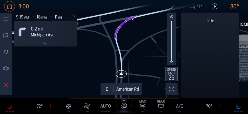
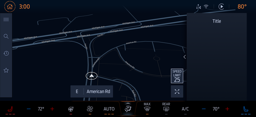
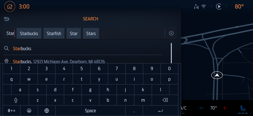
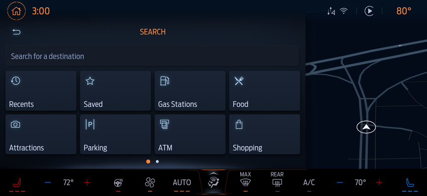
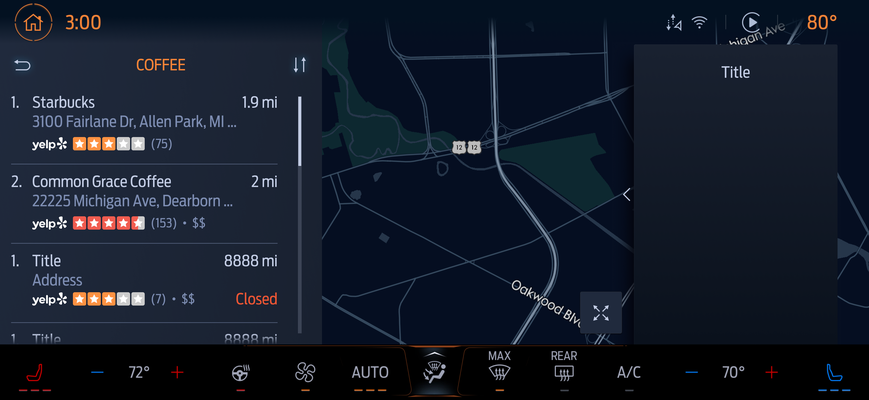
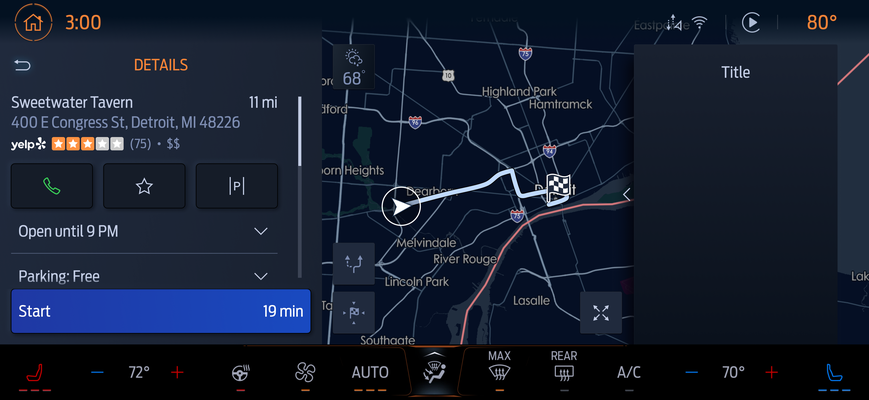
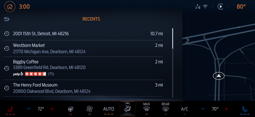
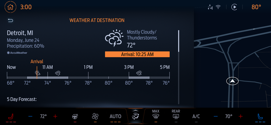
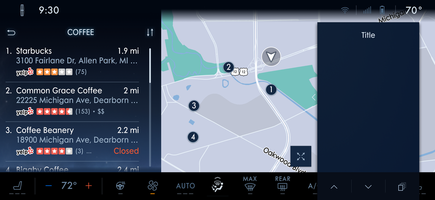
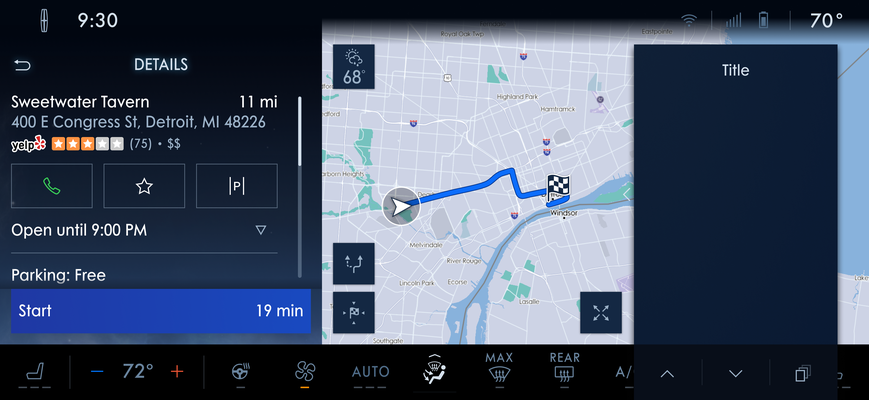
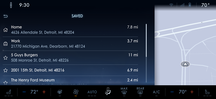
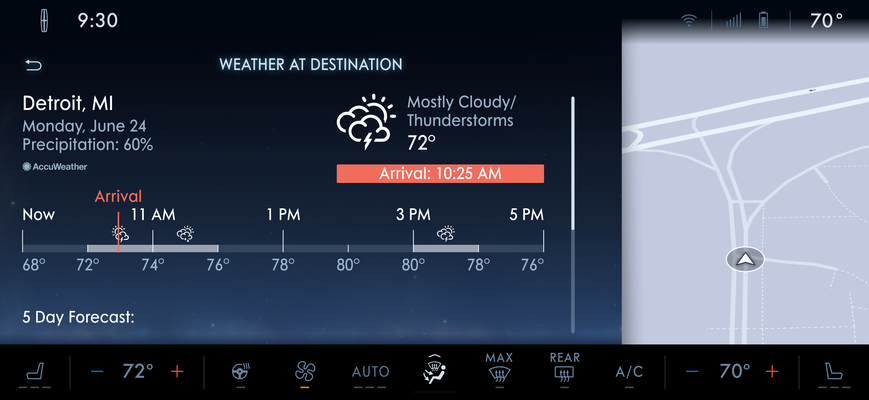
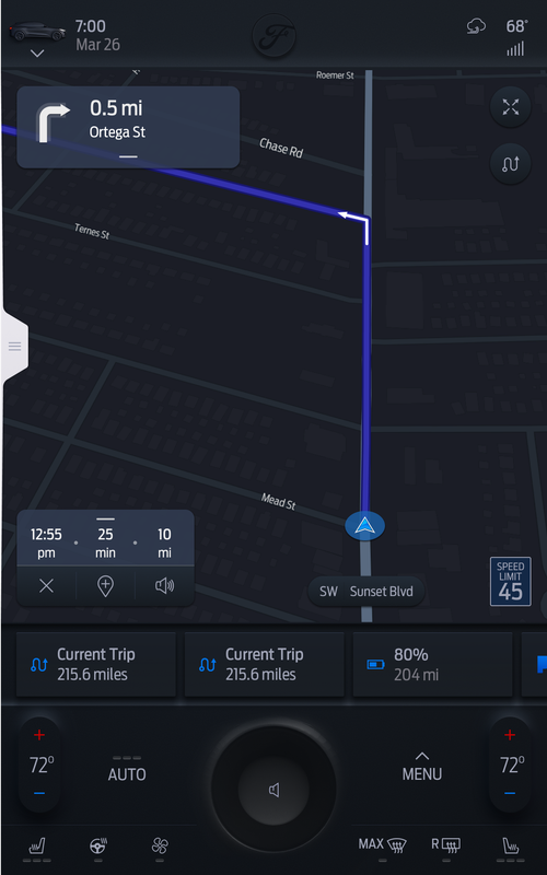
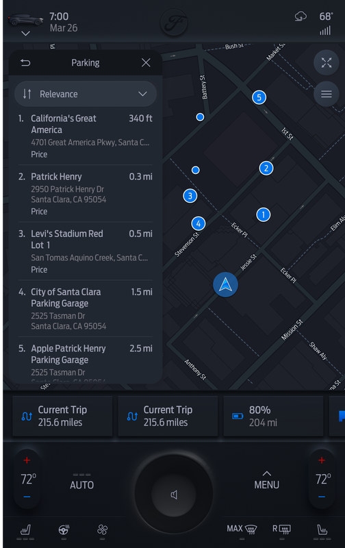
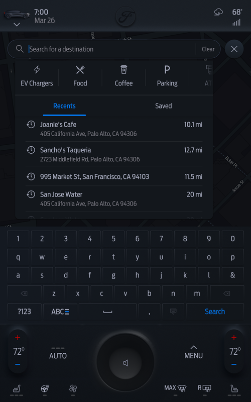
04 — Screens
The work,
size by size
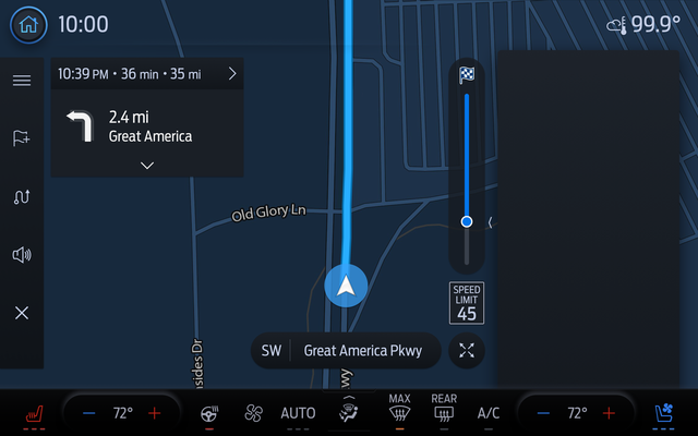
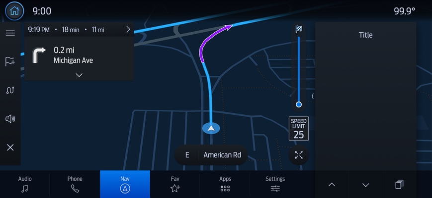
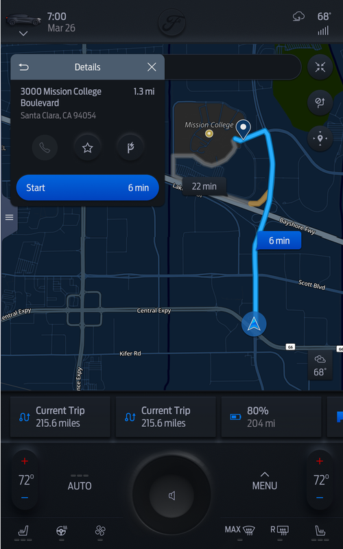
A full redesign proposal built under extreme deadline pressure — two weeks straight, late nights, the team working at maximum capacity. TomTom won the contract. They used our design.
05 — Reflection
What this work
actually teaches you
Production design at OEM scale is a different discipline from product design. The artifact isn't a prototype — it's a spec that engineers implement in a vehicle that has to pass regulatory review and then go on the road. Mistakes don't get hot-fixed. There's no "ship it and iterate."
The constraints are real constraints, not design principles. Ford's minimum font sizes exist because someone decided what's legible while driving. The three-language requirement isn't an edge case — it's a product requirement for market. Every screen has to work in all conditions before it's done.
What this work builds is an instinct for systems thinking under pressure. Not "what's the best design" in isolation, but "what's the right decision given these constraints, this timeline, and the hundred other screens this has to be consistent with." That's a different and harder question — and answering it repeatedly is what makes a senior designer.
The work shipped in real vehicles. The proposal was good enough to reuse. The system held across four screen sizes, two OEMs, and three languages.