01 — Context
The brief was
insurance upsell.
We made something else.
Telenav ran a design workshop with an unusual format: each designer picked a top App Store app, studied what made it work, and presented their findings to the full team. My team chose Duolingo — specifically its use of streaks, positive feedback loops, and intrinsic motivation to make something hard feel worth doing every day.
After the presentations, the teams split and applied what they'd learned — not to education, but to driving. The goal was to explore how gamification could make safe driving more engaging, with a secondary angle around Novo's insurance product.
The Duolingo study shaped everything. Good Driver's entire philosophy — reward the behavior you want, don't penalize the behavior you don't, make progress visible — came directly from what we observed in how Duolingo handles learning.
"Make the behavior you want feel like something people choose — not something they're required to do."
02 — My Role
What I
owned
- Led design for Team A (Good Driver) through the full sprint
- Defined the product philosophy: positive reinforcement over surveillance
- Designed onboarding, gamification loop, garage, trips, and challenges
- Created the visual identity — logo, color system, app icon
- Directed 3D car customization concept and digital commerce model
- Designed the in-car extension (Ford/Lincoln mockup)
- Created branded merchandise concepts (swag)
- Produced a brand ad — hired a voice actor to recreate Matthew McConaughey's Lincoln commercial with Good Driver voiceover
- Later contributed the Safe Miles mechanic into Novo mobile, NICA, Scout, and ZNLT token rewards
This was a two-day sprint, which meant every decision had to be fast and defensible. I was responsible for both the product thinking (why does this mechanic exist, what behavior does it reinforce) and the execution (actual screens, actual identity, actual pitch).
The sprint format also meant the work had to communicate on its own — no time for lengthy presentations. The screens, the identity, the swag, and a brand ad produced in the same two days all had to tell the story immediately. When your pitch includes a fake Matthew McConaughey Lincoln commercial, you've committed to the concept.
03 — The Sprint
Two days,
zero to shipped concept
The workshop ran as a structured sprint: half a day of briefing and brainstorming, then the teams split and worked independently before a final presentation. The constraint wasn't capability — it was time. Everything that existed at the end of day two was designed, identified, and presented in under 16 working hours.
The team also produced a brand ad: a voice actor hired to sound like Matthew McConaughey, overdubbed onto his real Lincoln bull commercial. We cut it into a Good Driver spot. It was the most effective 90 seconds of the entire presentation.
04 — Two Philosophies
Same brief.
Opposite instincts.
The most interesting thing about the sprint wasn't either concept individually — it was how differently two groups of designers read the same brief. Both teams rejected the insurance-first framing. But what they built in response revealed two genuinely different theories about what makes behavior change work. Zilla came later — it was the synthesis. These were the two original ideas it grew from.
05 — Good Driver
The product,
screen by screen
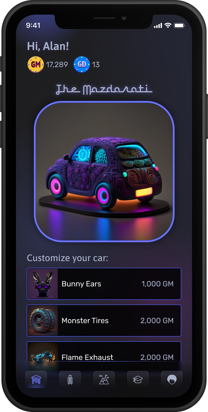
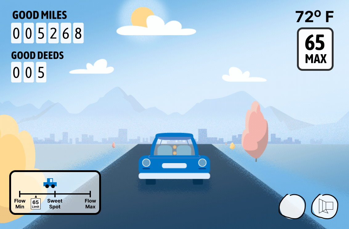
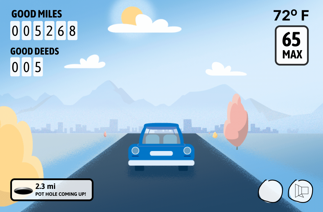
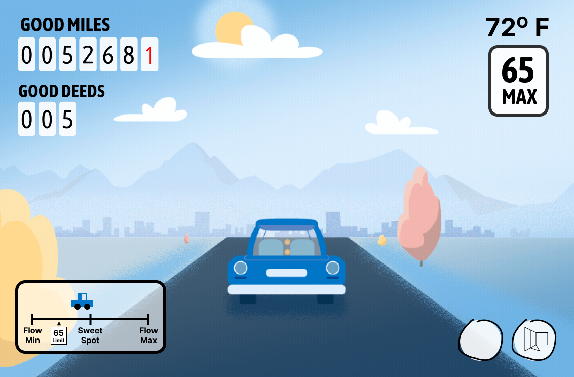
Good Driver is built around one core loop: drive safely → earn Good Miles → spend them on your car. Five screens, a clear hierarchy, and a visual language that feels more like a gaming app than an insurance product.
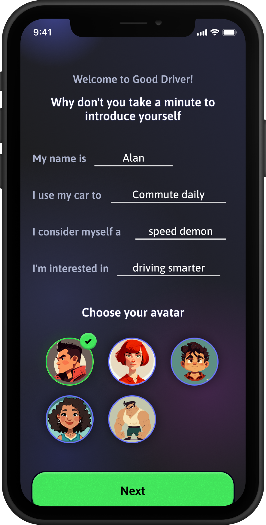
Onboarding establishes the premise immediately: you're a good driver, here's how to prove it. The introduction form asks what kind of driver you are and lets you choose an avatar — framing the product as personal from the first screen.
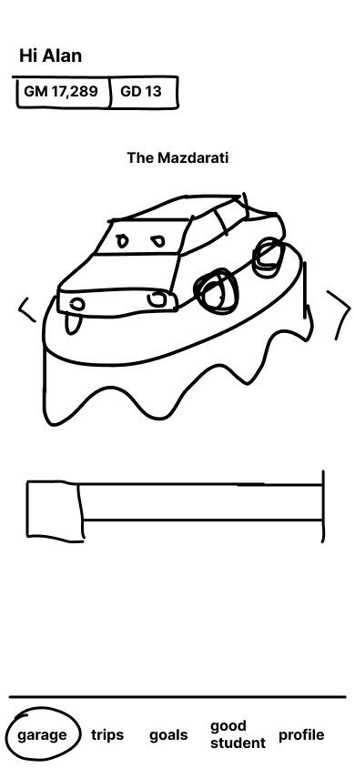
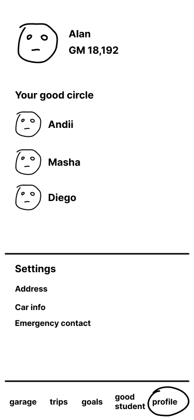
The Garage is the home screen. Your car — named by you, customizable with earned items — sits at the center. Good Miles and Good Deeds balances are always visible. This is the reward surface: the thing you're driving toward.
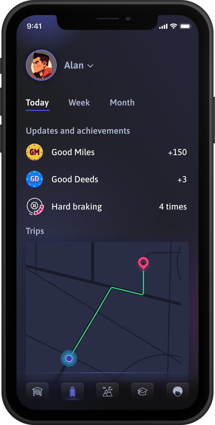
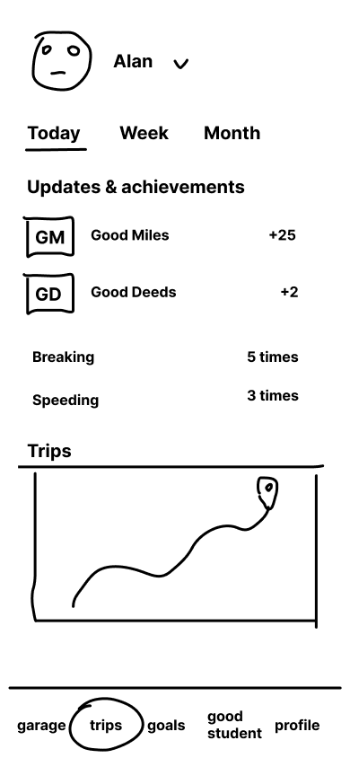
Trips shows your daily earnings and driving events with a map of your route. Positive metrics lead. Negative events are listed below — present but not the headline.
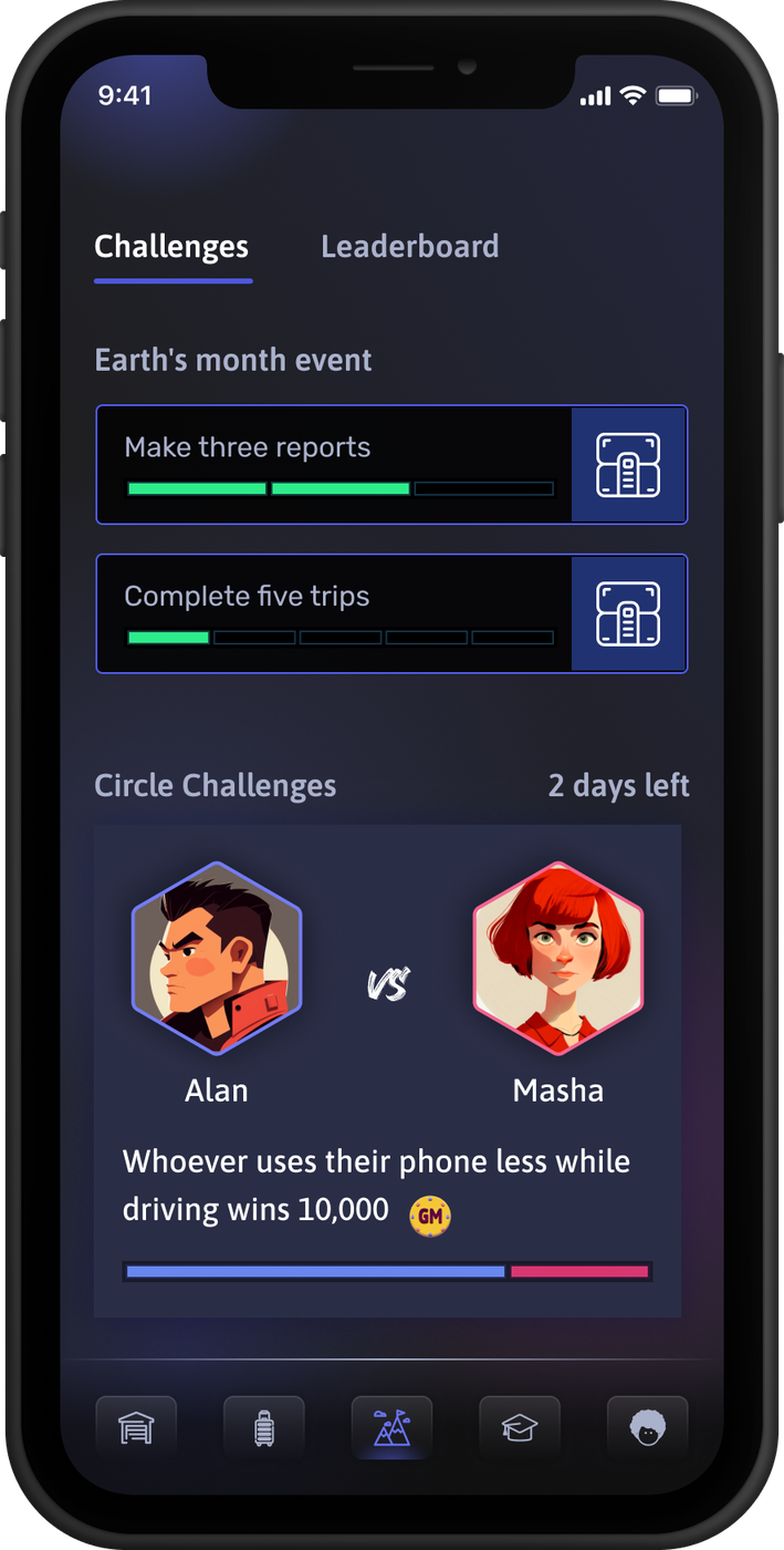
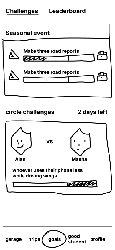
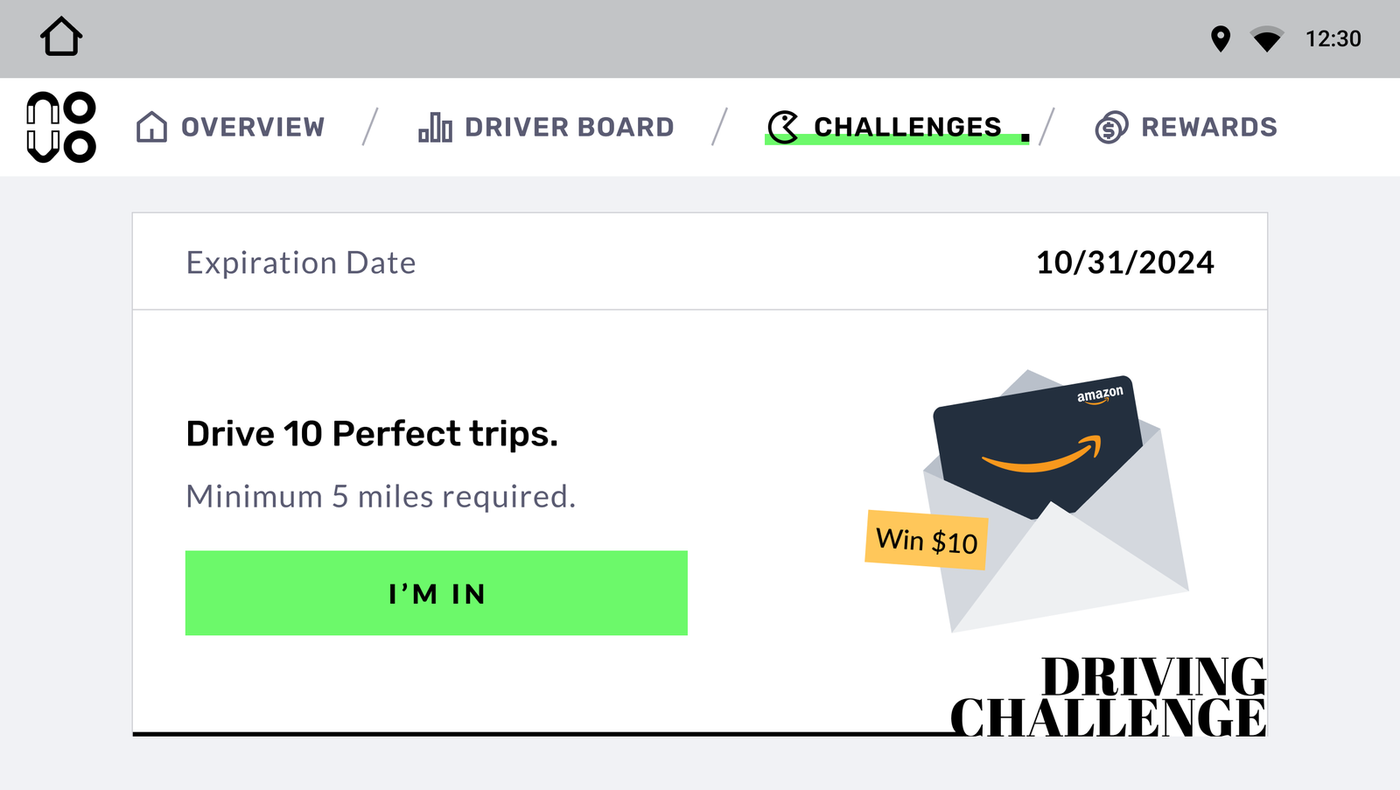
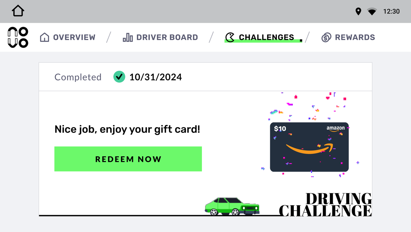
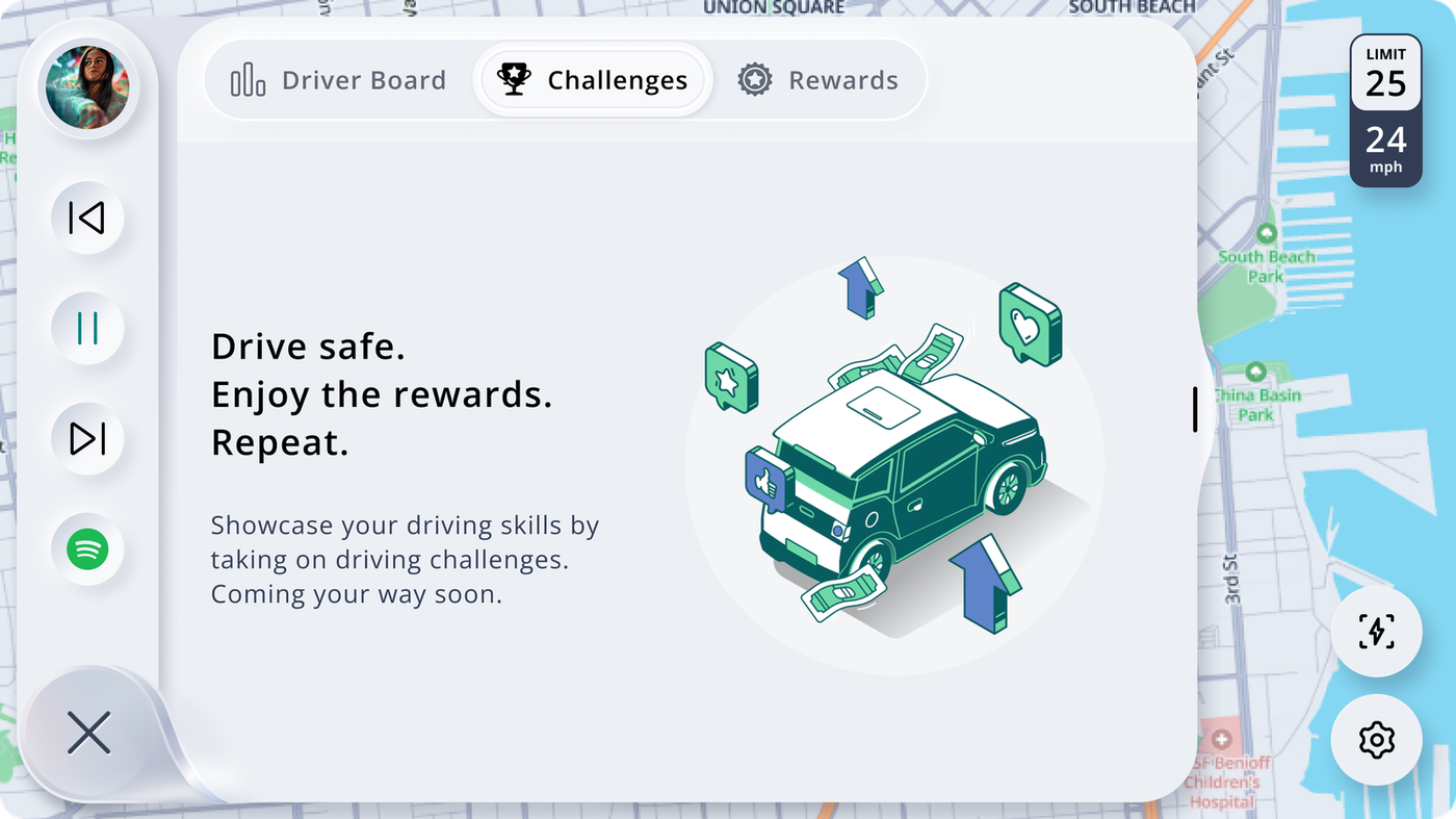
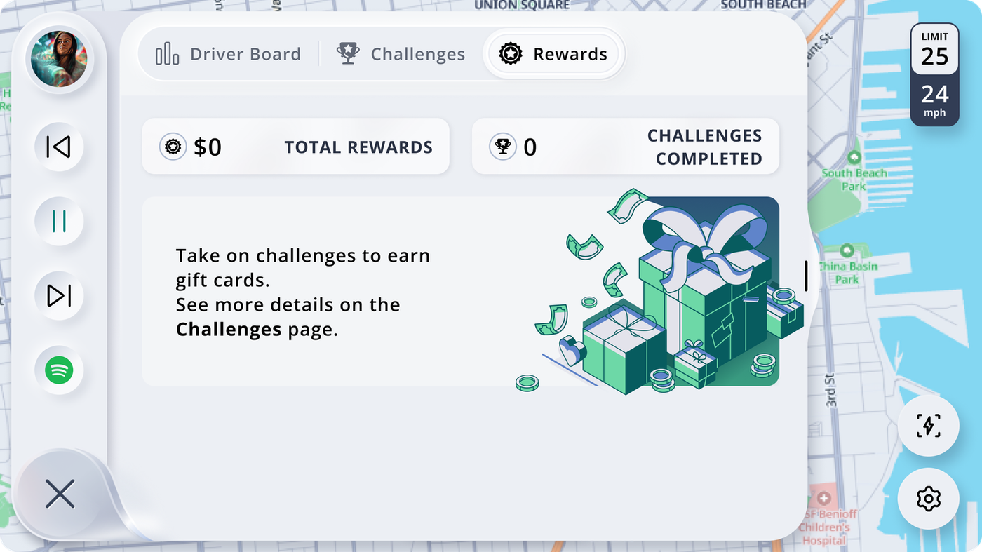
Challenges introduces social competition: head-to-head challenges against people in your "Good Circle." Whoever uses their phone less while driving wins.
06 — Process
Sketch to screen
in one day
Garage
Trips
Goals
Profile
Day 1 wireframes — all screens sketched in the first session
All four screens were sketched in the first work session. The layout logic was established before anyone opened Figma — information hierarchy, nav structure, the balance between positive and negative feedback. The structure didn't change; only the fidelity did.
This kind of sketch-to-final velocity only works if the decisions in the wireframe are real. The sketch isn't a rough pass — it's a working spec drawn fast.
07 — Design Vision
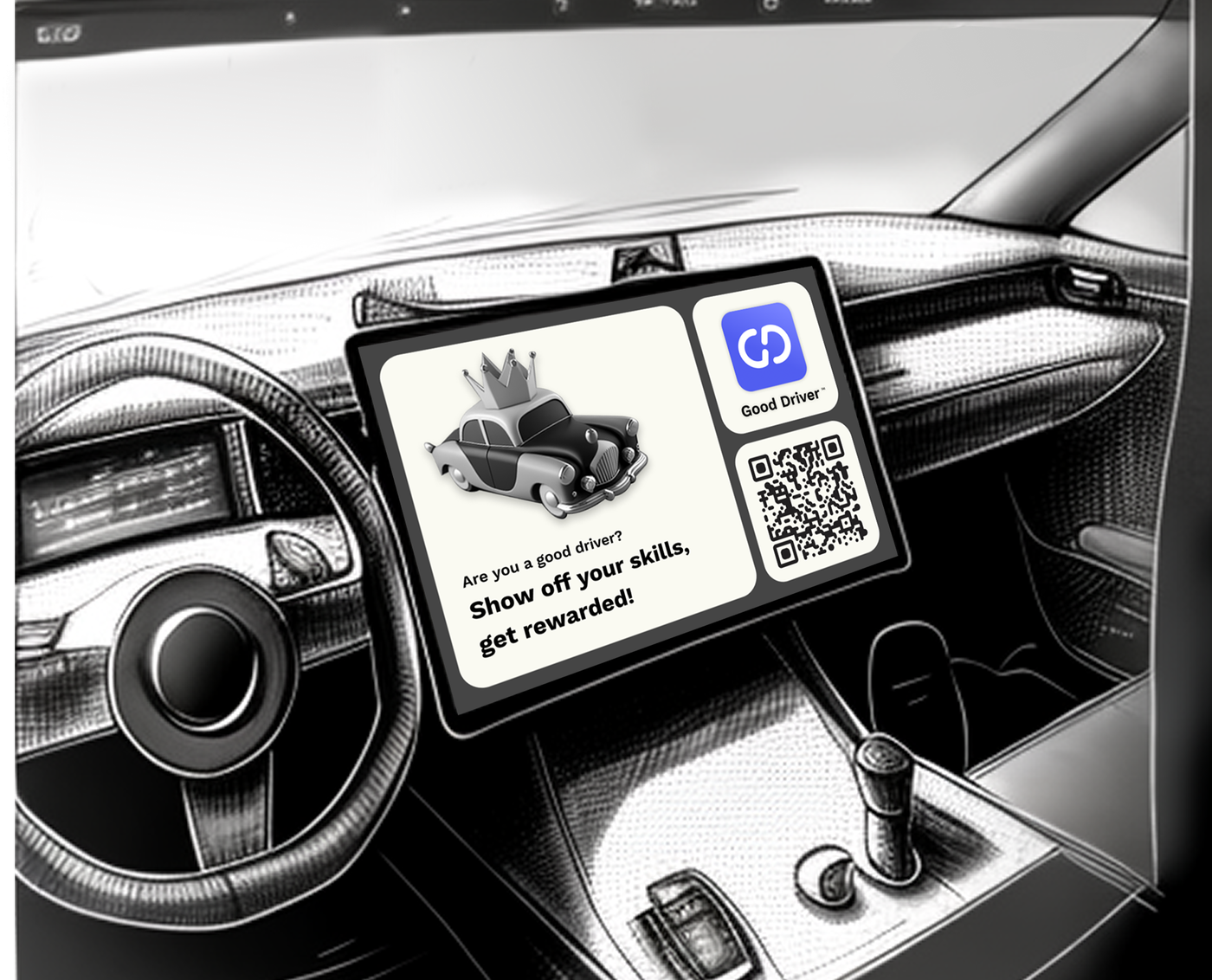
The in-car
experience concept
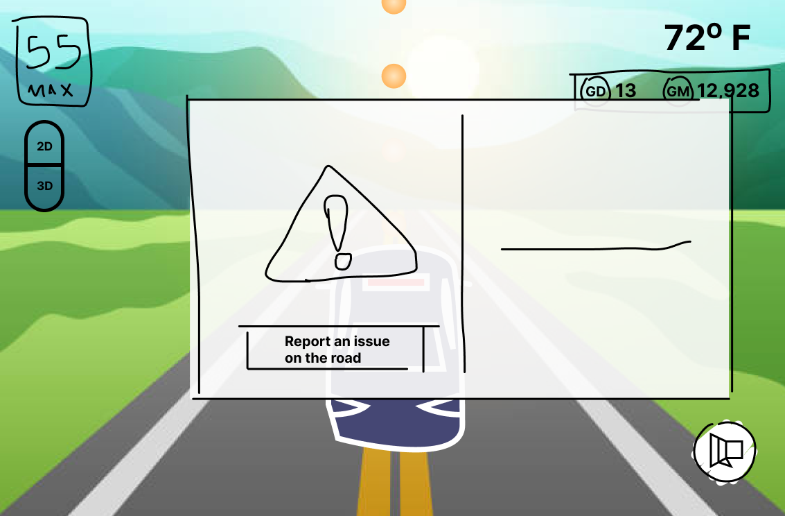
Beyond the mobile app, the team explored what Good Driver could feel like as an embedded driving experience — a real-time companion that responds to your driving as it happens. Not a post-trip summary, but something ambient: earning Good Miles visually as you drive, getting gentle nudges at the right moment, and feeling the weather and road conditions reflected in the interface.
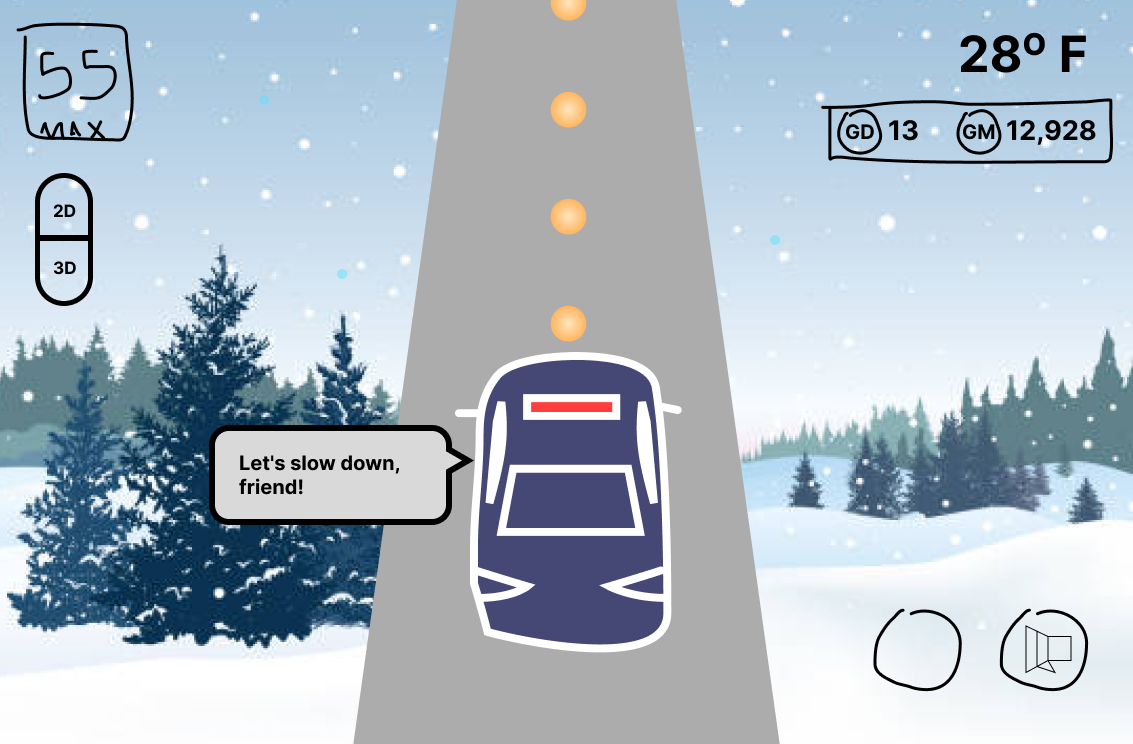

In-car driving concept — Good Miles earned in real time, ambient coaching, road condition awareness
08 — Learning System
Learn by doing,
not by watching
Good Driver included a learning system built on mini-games rather than tutorials. The parallel parking game uses a 3D top-down view with a steering wheel input — you practice the maneuver in a simulated environment and earn Good Miles for completing it.
The OX hazard game puts you in a moving-car scenario where you have to make the right call — brake or turn on high beams — as road hazards appear. It earns points while reinforcing real driving decisions.
The principle: learning should feel like play, not homework. Both games are short, replayable, and directly tied to the earnings system so there's always a reason to come back.
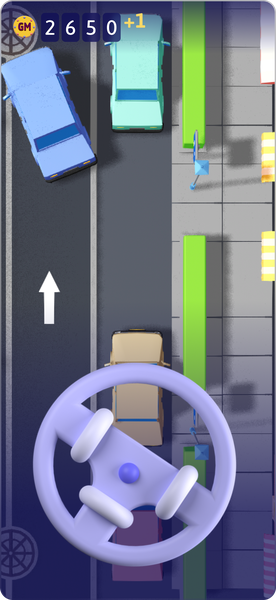
Parallel parking game
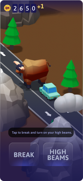
OX hazard mini-game
3D illustrations built in Spline by a collaborating designer.
09 — Platform & Brand
Beyond the phone:
in-car and merchandise
Good Driver was conceived as a cross-platform experience from day one. The car you customize on your phone appears in the dashboard of your vehicle — your avatar drives alongside the navigation UI. The brand extended further into physical merchandise: a beanie and mug with custom car artwork, designed to show that this could be a product people identify with, not just an app they use.
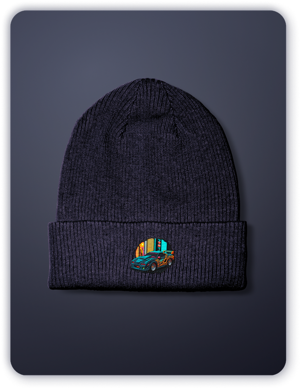
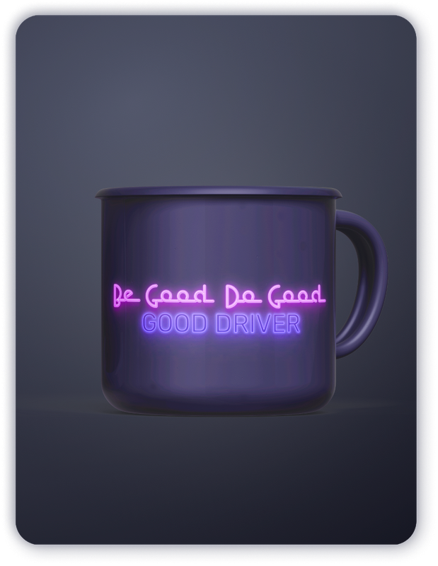
Merchandise was part of the pitch — showing that Good Driver had the potential to be a brand people choose, not just a product they're enrolled in. The custom car art on the swag is generated from the user's in-app vehicle.
09 — Zilla
The synthesis:
enter Zilla
Zilla wasn't Team B's original concept — it came later, as a deliberate synthesis of both approaches. Good Driver's reward loop combined with the Monster App's creature-based mechanics produced something neither team had built alone.
The monster universe got named, expanded, and fully realized: 18 characters, each tied to a specific driving behavior or road condition. Brakezilla (hard braking), Speedzilla (speeding), Parkzilla (high-theft areas), Nightzilla (late-night driving), Jamzilla (traffic jams). Full collectible system — rarity, levels, card stats, battle mechanics.
The insight both teams had landed on — safe driving should be intrinsically motivating — now had two expressions working together: Good Driver's positive identity layer, and Zilla's mastery-and-collection layer. Two ways into the same behavior change.
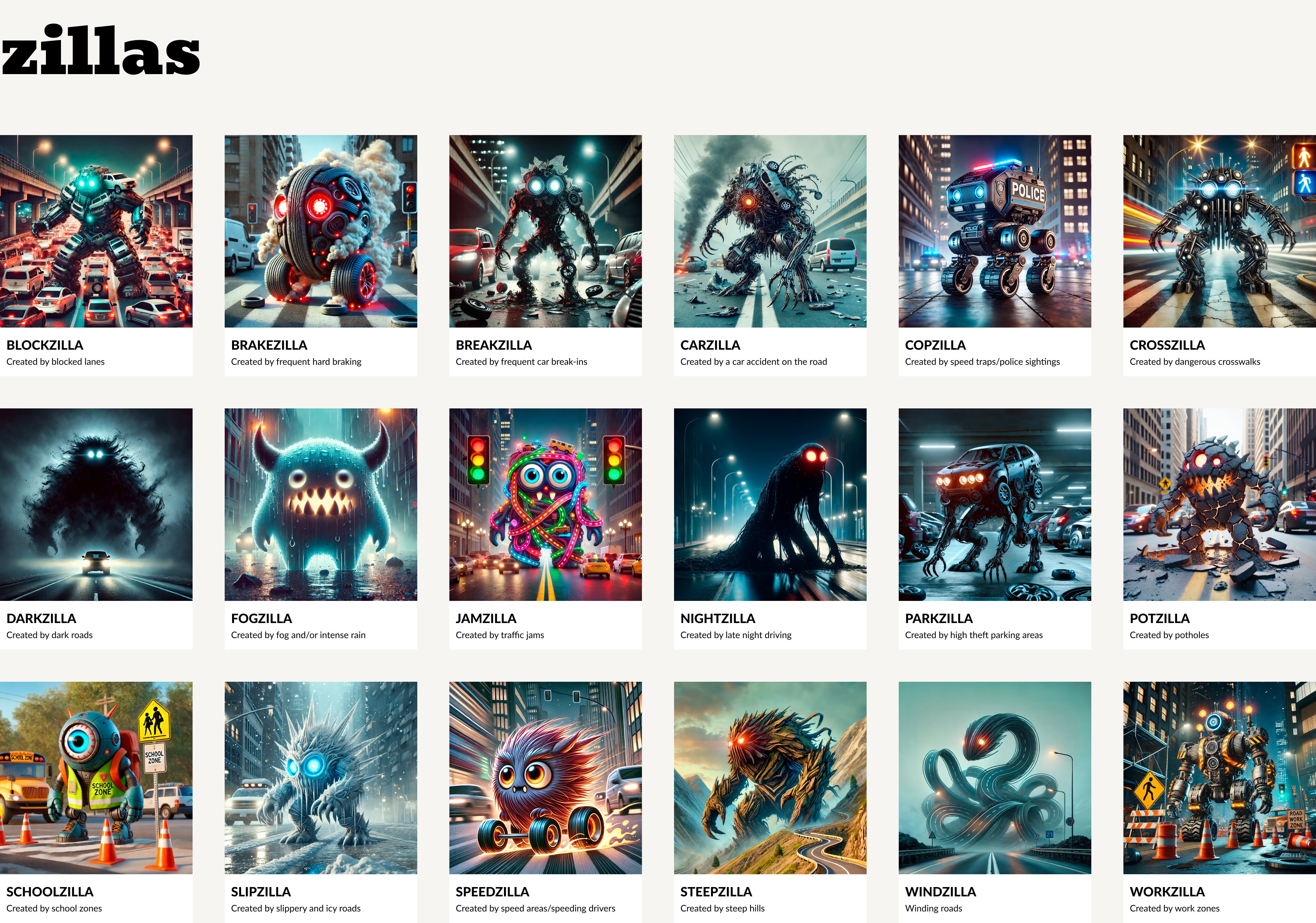
All 18 Zillas — each created by a specific driving condition or behavior.
10 — Synthesis
Good Driver + Monster App
= Zilla
After both teams presented, the clearest outcome wasn't that one concept won — it was that the two concepts described different parts of the same product. Good Driver was the positive layer: earn, customize, improve. The Monster App was the engagement layer: collect, battle, conquer.
Zilla came out of that synthesis. It took Good Driver's reward currency and the Monster App's creature mechanics and combined them into one product — a second app that could sit alongside Novo as a companion experience. The Zilla name, the expanded monster universe, the card system — all post-sprint work that grew from those two original concepts.
That companion app never shipped as a standalone product. But the ideas didn't disappear.
Good Driver's reward loop + Monster App's creature mechanics = Zilla. Neither concept alone. Both concepts together.
11 — What Shipped
One idea.
Multiple lives.
The Safe Miles concept didn't ship once — it evolved across products and took on different forms depending on what each product needed. Points in Novo. Real tokens in ZNLT. Gift card redemptions in NICA and Scout. The same core idea — reward safe driving with something tangible — expressed in four different ways across two years.
Evidence — across all four products
12 — Reflection
What this
project actually is
Good Driver started as an internal workshop exercise. It ended up influencing four products over two years — and the core idea kept evolving. Points in Novo. Tokens in ZNLT. Gift card redemptions in NICA and Scout. The same question asked at different altitudes: what is a safe mile actually worth to someone?
The sprint format forced a kind of clarity that longer projects don't always produce. There was no time to hedge. You pick a point of view and build it completely. The two teams built very different things, but both built them completely — and that's why the synthesis worked. You can't combine two vague ideas. You can combine two sharp ones.
The mechanic that traveled furthest and took the most forms — Safe Miles — is also the simplest one. That simplicity was a deliberate decision in the sprint, and it's why it survived every translation from concept to product.
A concept that ships one idea cleanly outlasts a concept that ships ten ideas vaguely.