01 — The Challenge
One product.
Twelve screen sizes.
Novo was already a functioning mobile product — tracking driving behavior and translating it into scores, milestones, and pricing signals. The ask was to bring that into the car, embedded in the infotainment system.
On the surface, it sounds like a port. It wasn't. In-car screens vary in size, aspect ratio, pixel density, interaction model, and viewing conditions. A driver glancing at a 10" portrait display in a Stellantis vehicle is in a completely different context than someone navigating a wide 15" landscape screen in an Audi. Same product. Entirely different constraints.
It had to work across all of it — consistently, safely, without a separate design for every configuration.
One UI. 12+ screen configurations. Two OEM platforms. Design while the car is moving.
02 — My Role
What I
owned
- Led the visual design of the in-car product, working in tandem with a UX designer
- Owned all responsive work — mapping 12+ OEM configurations, defining breakpoints, and building every layout variation
- Defined the 4 main breakpoints and the rules governing how content behaves across them
- Reworked mobile patterns into driver-safe interactions for in-car context
- Worked directly with Audi and Stellantis engineering and platform teams
- Delivered production-ready specs, assets, and component documentation
The responsive system was mine end-to-end — from researching all 11+ OEM head unit configurations, to choosing the 4 breakpoints that covered the real hardware spread, to building every layout variation that shipped.
Working alongside a UX designer meant I could focus deeply on the visual and responsive layer while the broader interaction model was developed in parallel.
Audi is still using it — available today in their App Store.
03 — Responsive System
Designing for
12+ screen sizes
Automotive infotainment screens don't follow a clean size grid — they range from compact 9" displays to ultra-wide 15"+ panels, across multiple OEM platforms each with different OS chrome and usable area. Before picking breakpoints, I mapped every head unit configuration to understand the full constraint space.
Research — all OEM configurations mapped
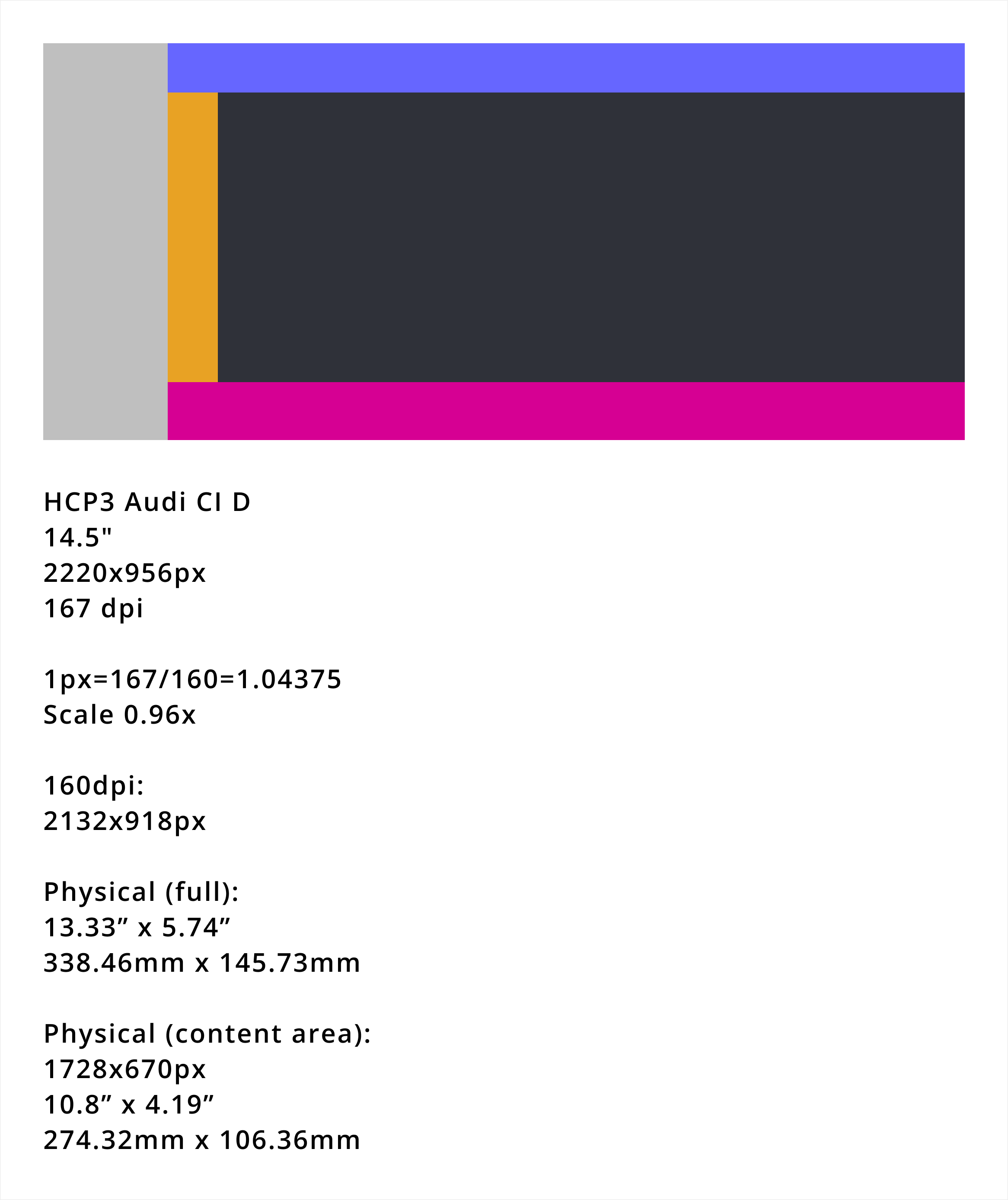
HCP3 · Audi 15"
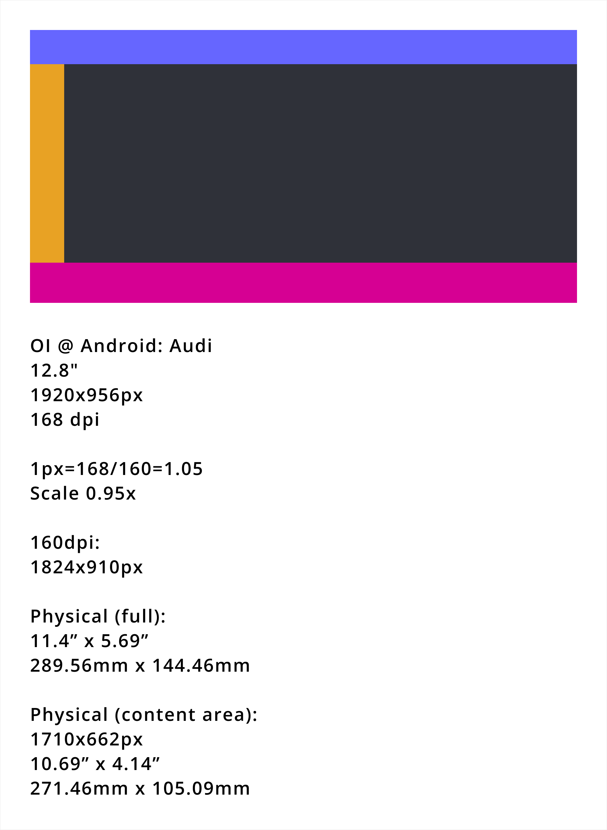
OI @ Android · Audi 13"
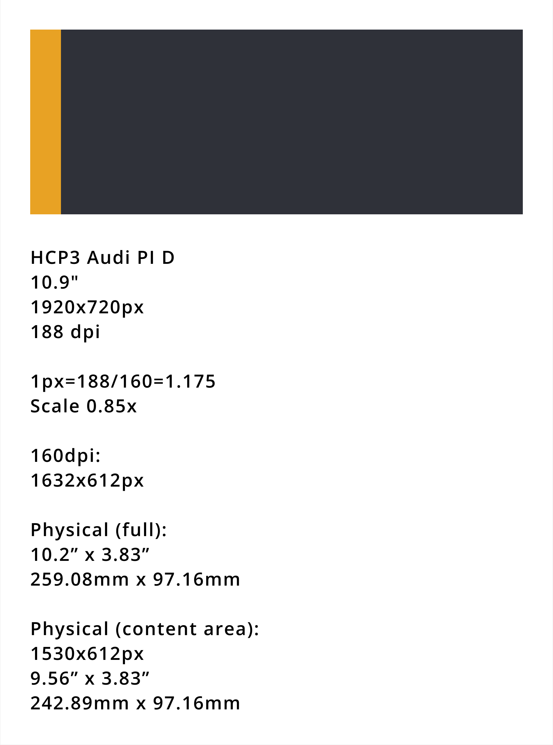
HCP3 · Audi PI D 11"
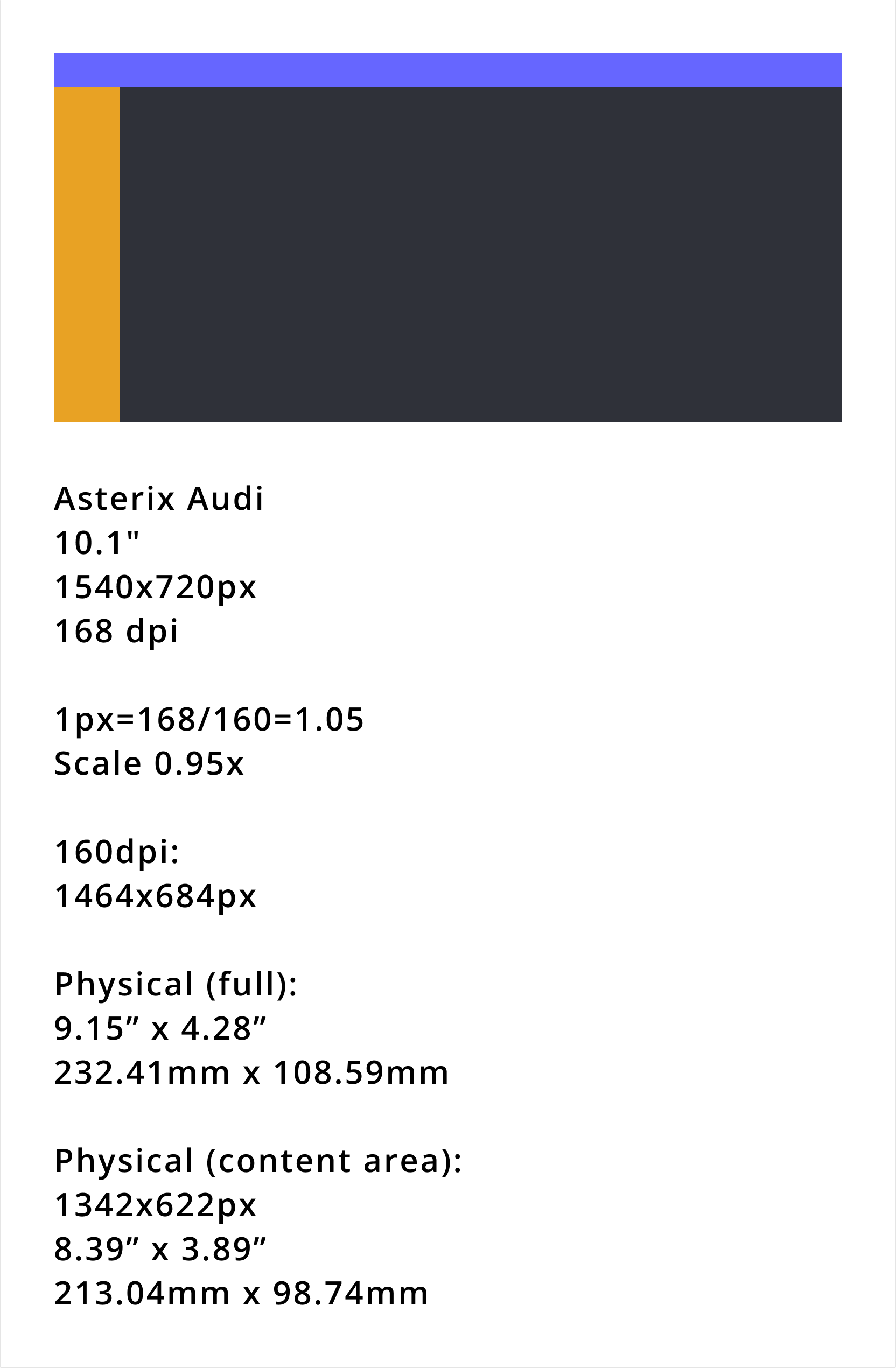
Asterix · Audi 10"
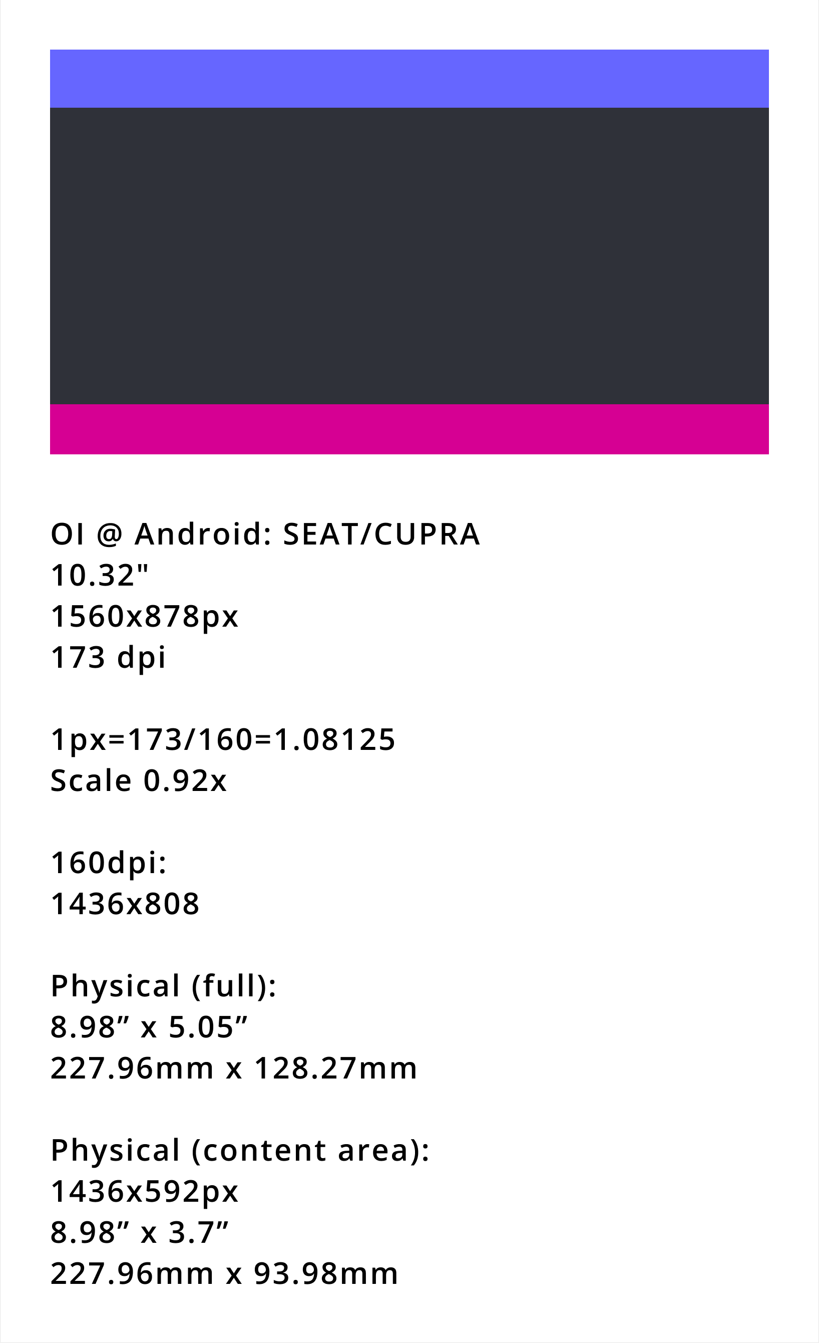
OI @ Android · SEAT/CUPRA 10"
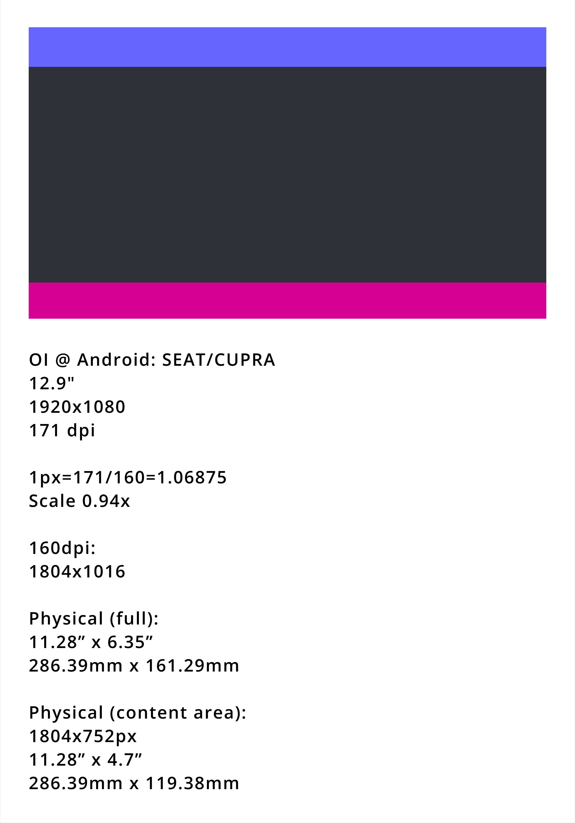
OI @ Android · SEAT/CUPRA 13"
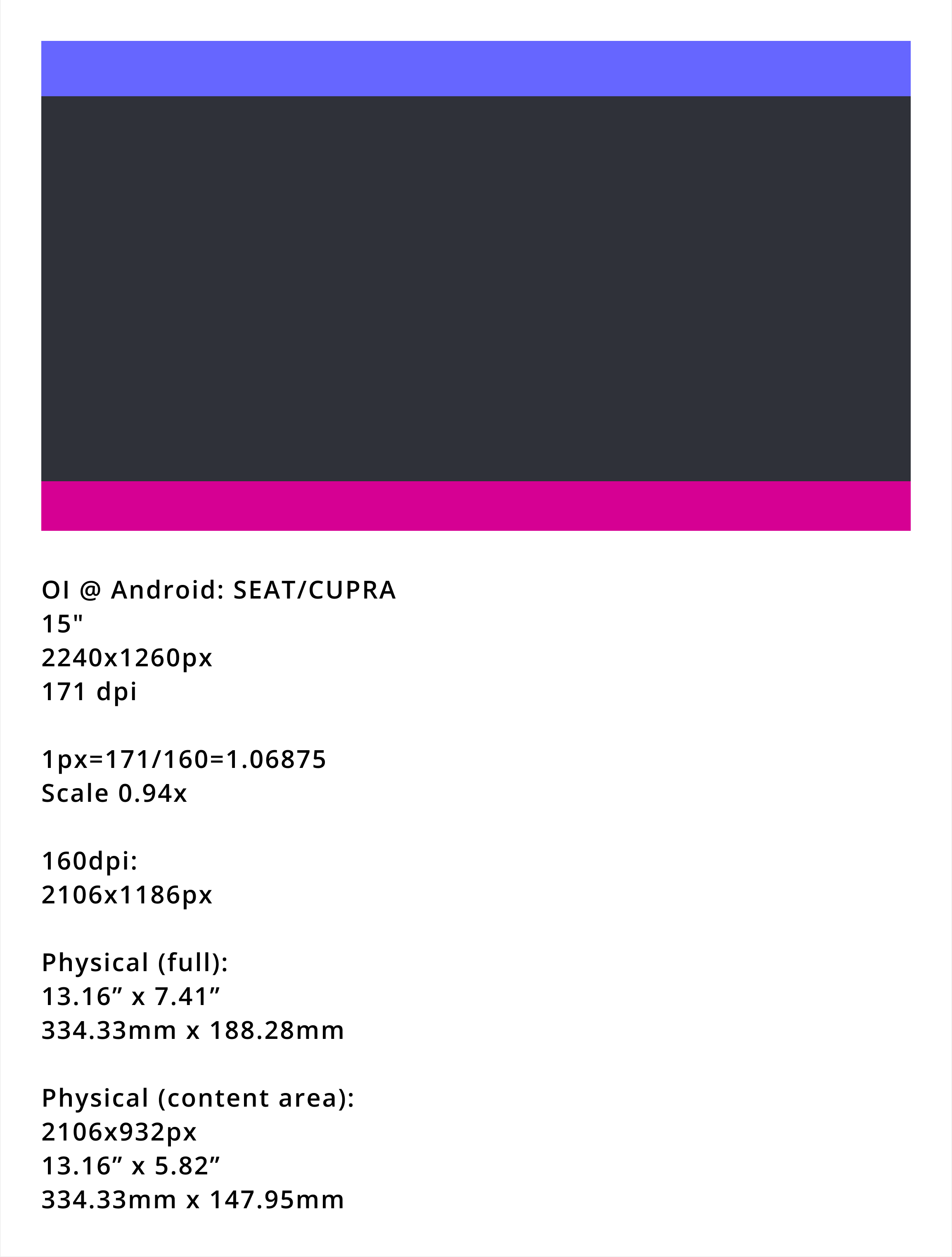
OI @ Android · SEAT/CUPRA 15"
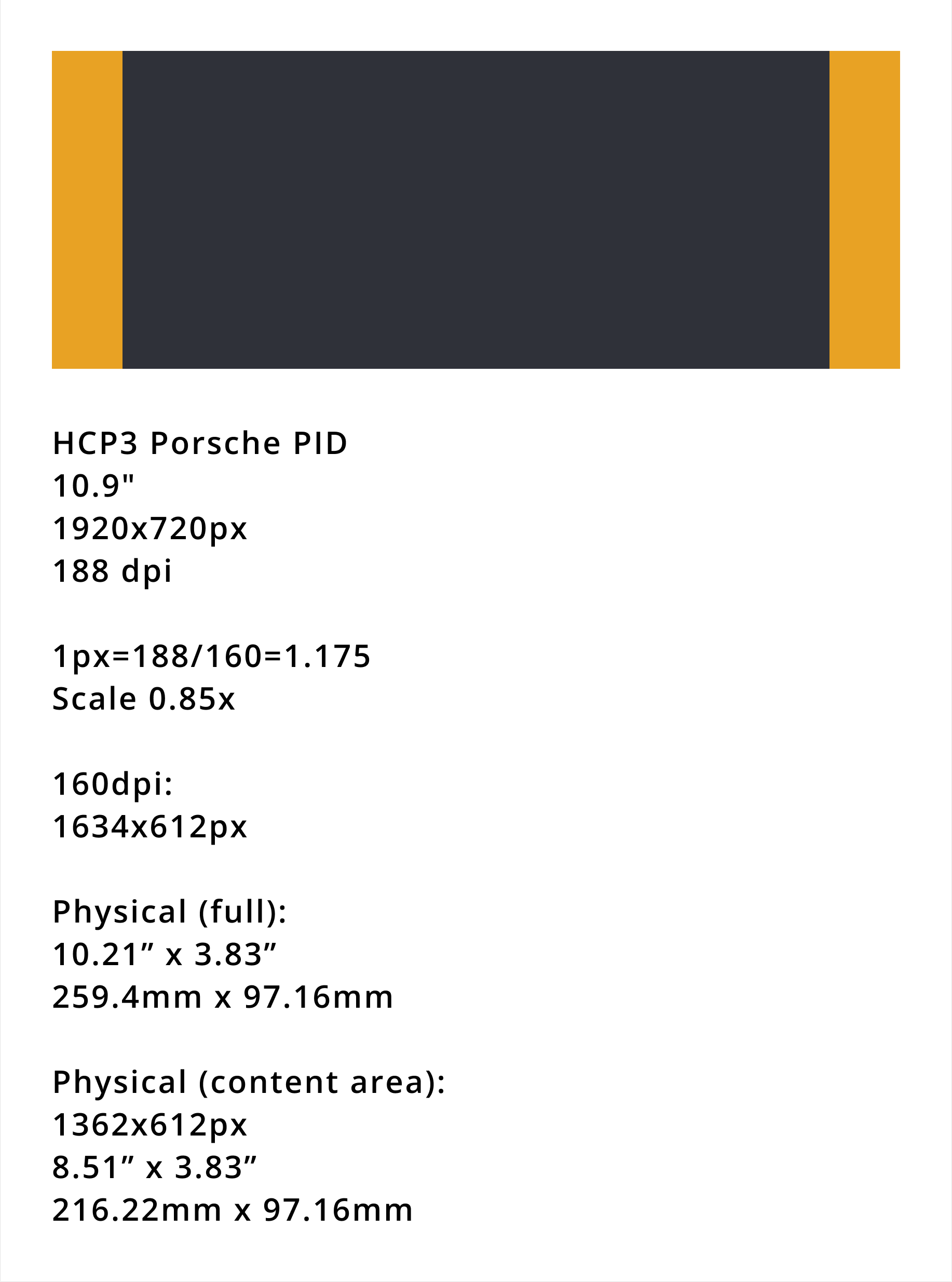
HCP3 · Porsche PI D 11"
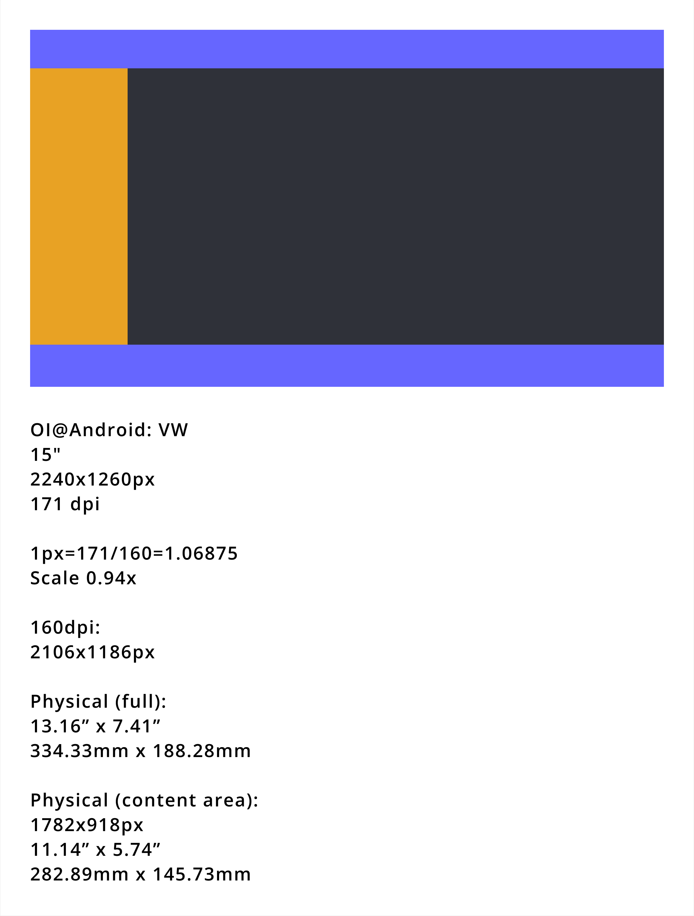
OI @ Android · VW 15"
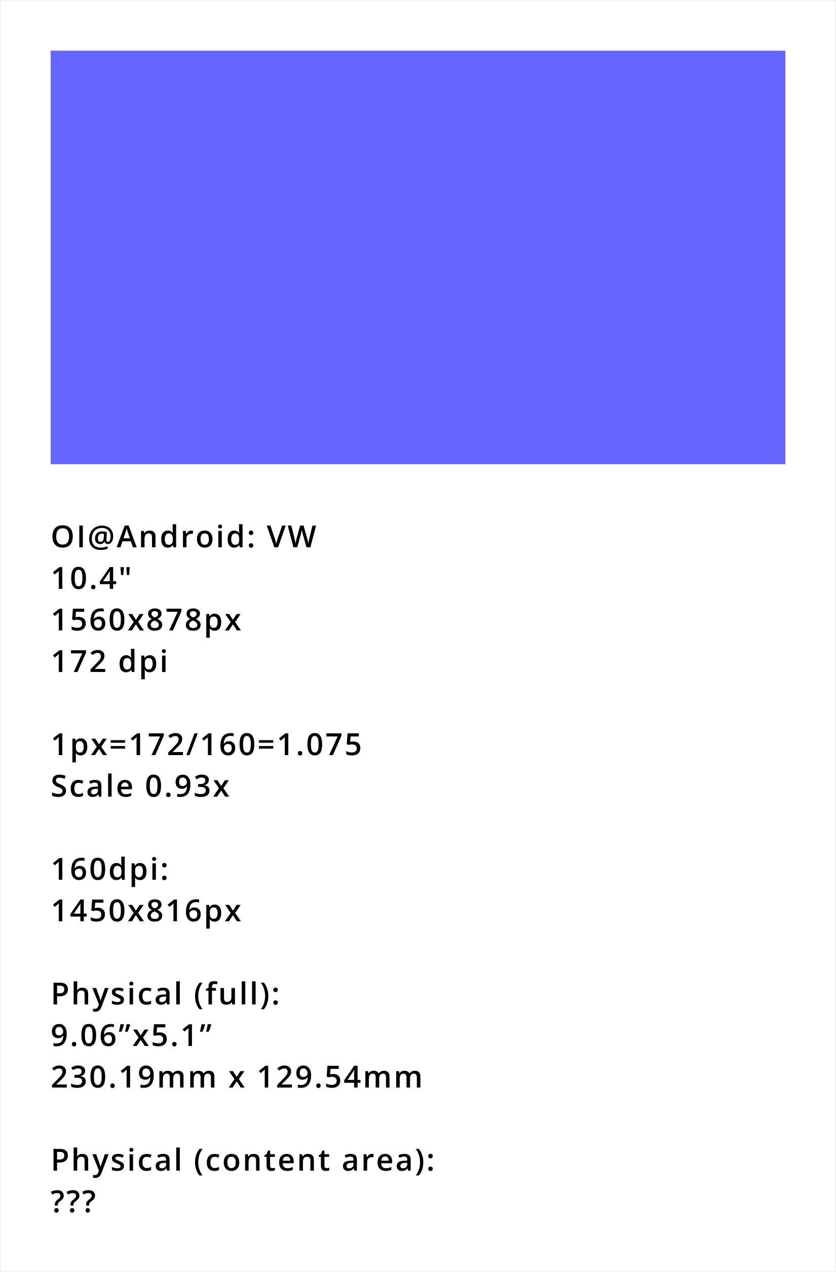
OI @ Android · VW 11"
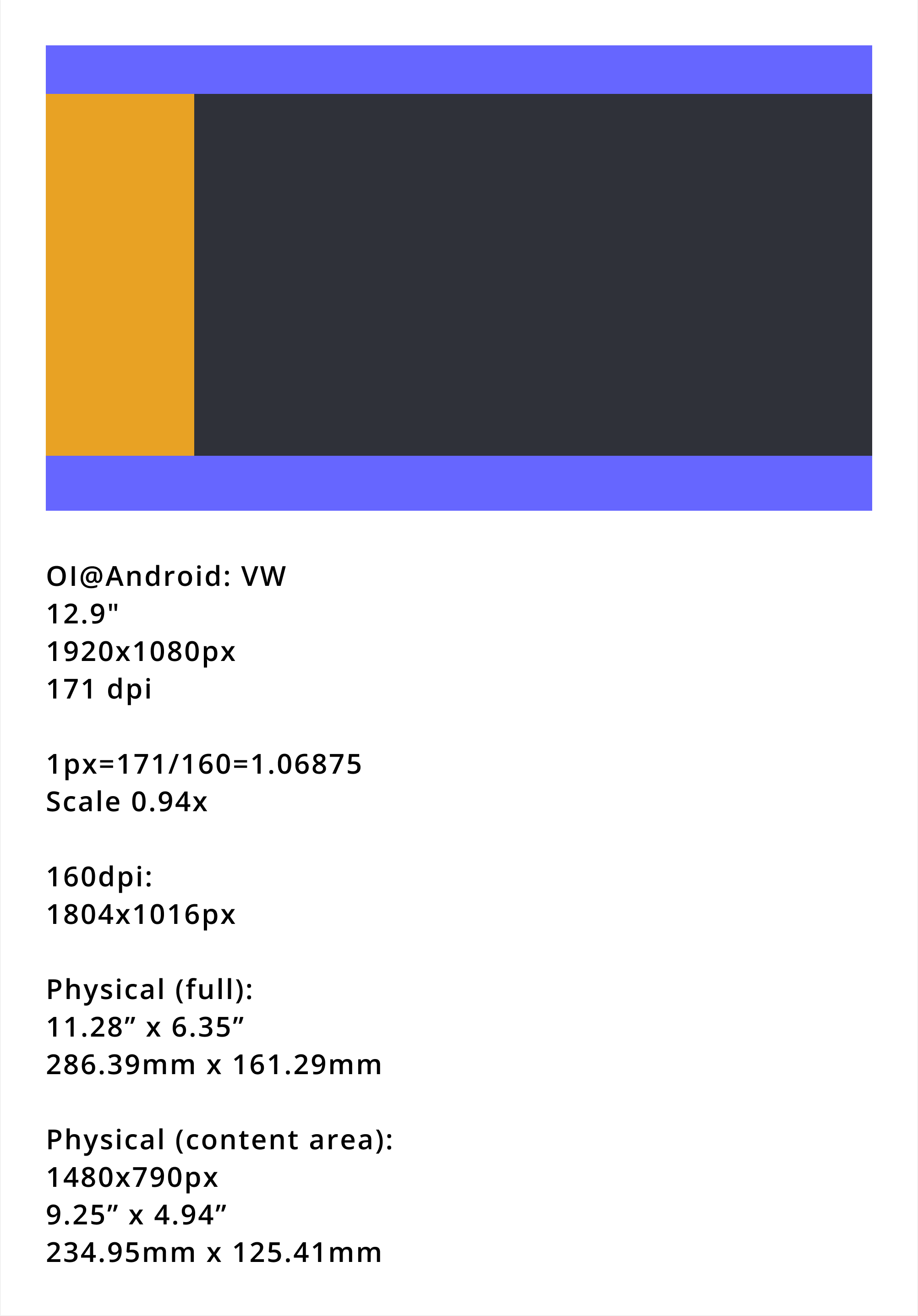
OI @ Android · VW 13"
The decision — 4 breakpoints defined
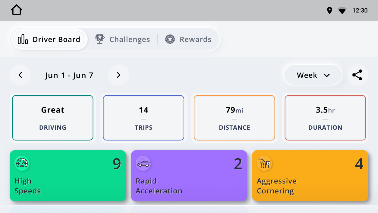
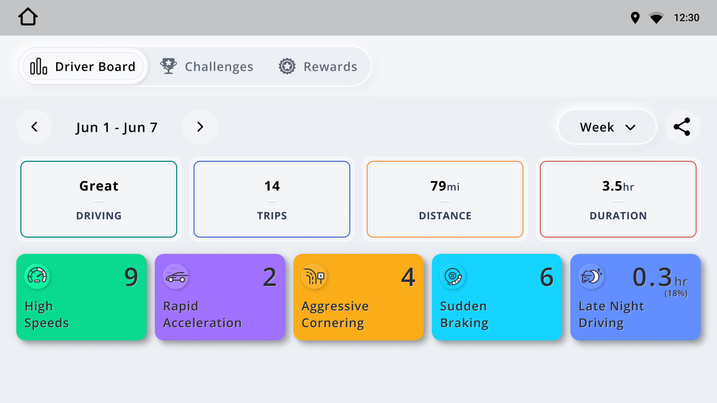
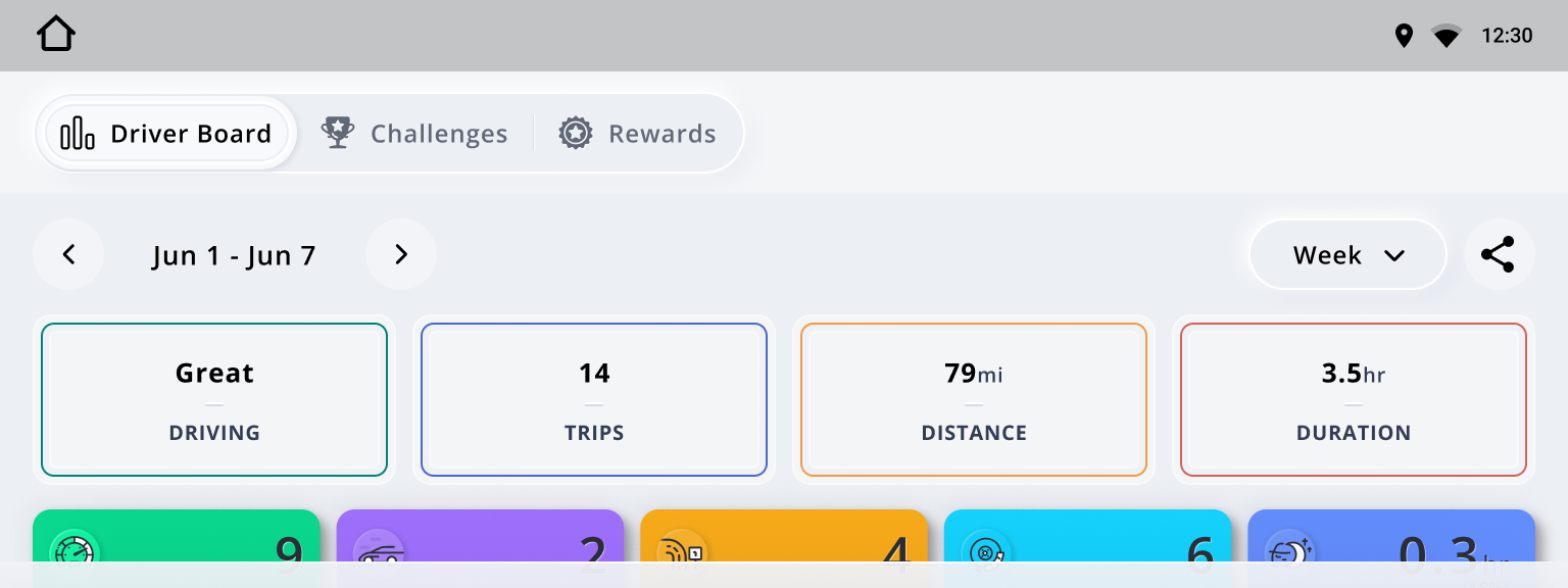
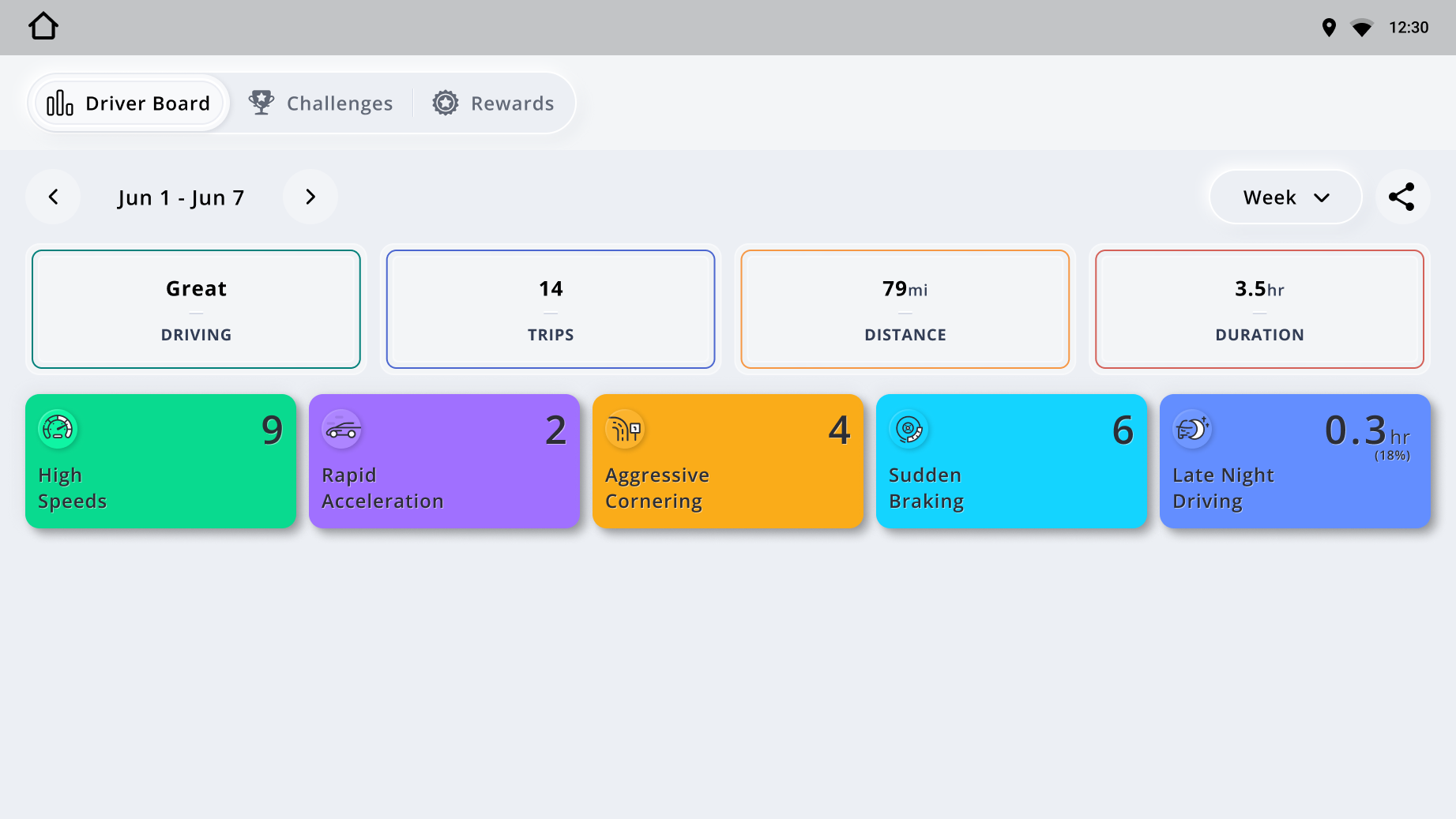
Driver Board
Standard layout. 4 safety stat cards visible.
Trip Details
Event tabs displayed at top.
Driver Board
Content area ≥ 1298px: 5 safety stat cards now visible.
Trip Details
Event tabs shift left from top → left sidebar.
Driver Board
Wide layout, optimised for low aspect ratio.
Trip Details
No in-app menu bar. Exit via hardware button or head unit dropdown.
Driver Board
Full layout — all 5 stat cards + persistent detail panel.
Trip Details
Full side-by-side layout, maximum content density.
Output — production screens at each breakpoint
04 — Design Decisions
Key decisions
and why
05 — Constraints
What shaped
the work
06 — Outcome
What was
delivered
The project delivered a fully documented responsive design system across all 12+ screen configurations, plus production-ready UI for the core experience: home screen, trip summary, score breakdown, milestones, and onboarding.
The system was built to absorb new configurations without redesigning. That proved out mid-project when one partner introduced a new vehicle line with a screen size outside the original spec. It was handled without a rework cycle.
Both partners completed design review. The Audi integration moved to engineering handoff. The Novo mobile team later used the system as a reference when revisiting their own component library — making it a cross-platform asset rather than a project artifact.
A new screen size appeared mid-project, outside the original spec. It was handled in an afternoon.