01 — The Product
Two ways
into Novo
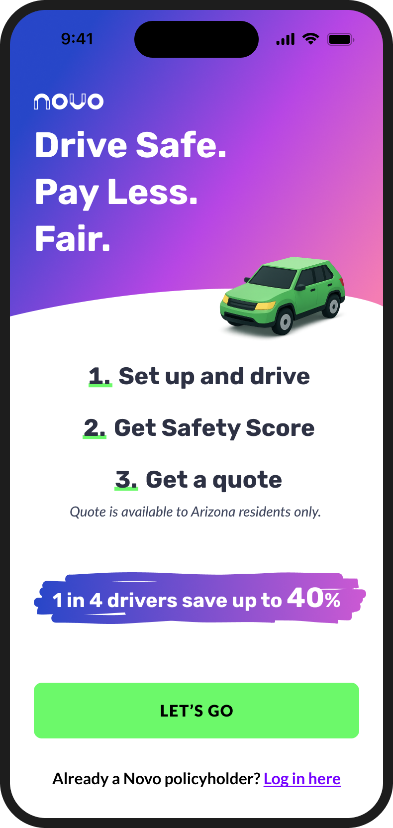
Novo is a usage-based insurance app — but access to the actual insurance product is only available to active policyholders. Everyone else can use Test Drive mode: drive normally, see your safety score, and find out what kind of discount you'd qualify for before signing up for coverage.
This distinction shapes everything about the product design. Policyholders need to complete setup — upload documents, register their vehicle, grant permissions — before they can use what they're paying for. Test Drive users need to understand what they're getting and feel enough confidence to convert. Two completely different jobs to be done in one app.
I worked on both sides alongside a UX designer. Some features we built together; some I owned fully. The Document Upload feature — which had the most measurable impact on policyholder retention — was designed entirely by me.
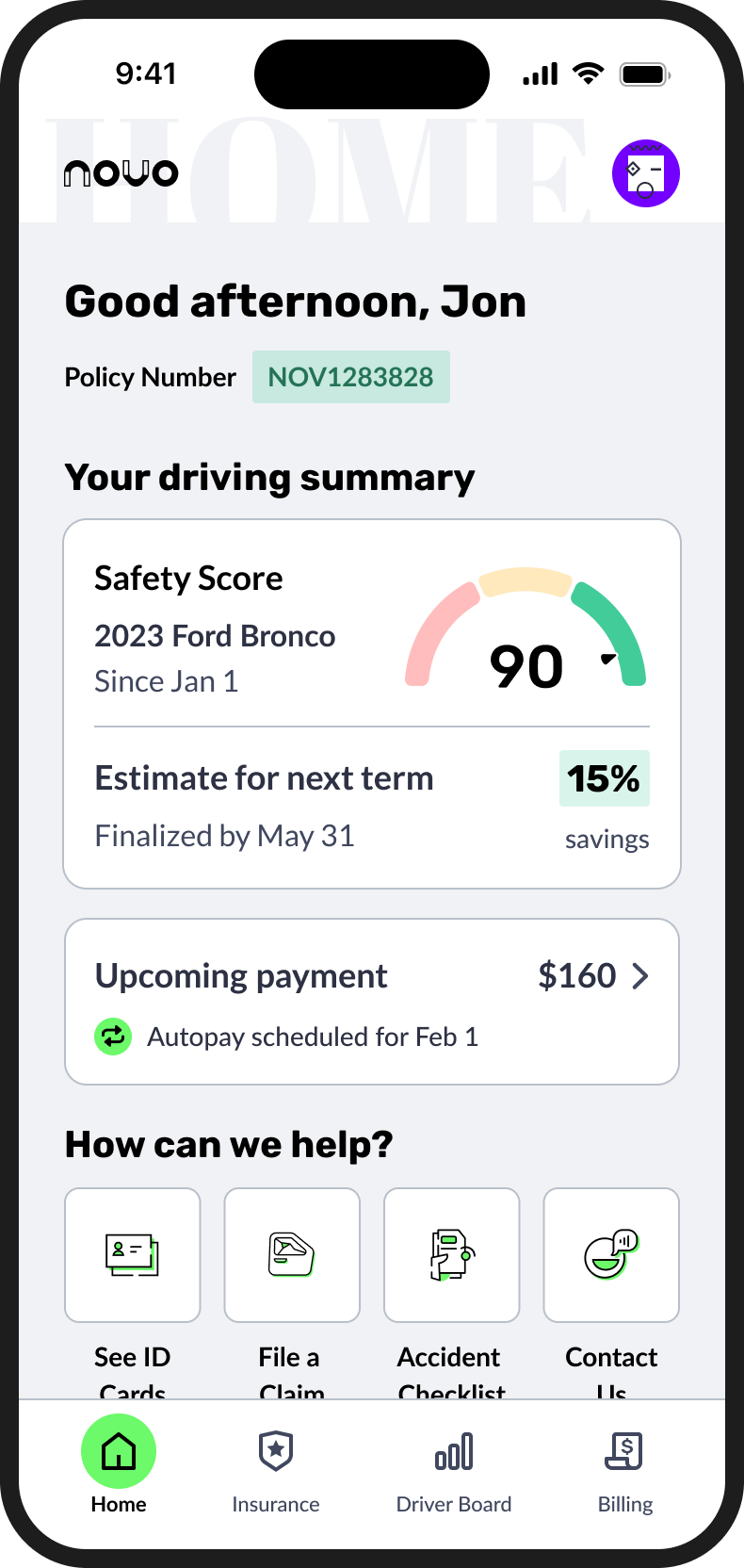
Active insurance customers. Must complete full setup to access coverage, score, and rewards.
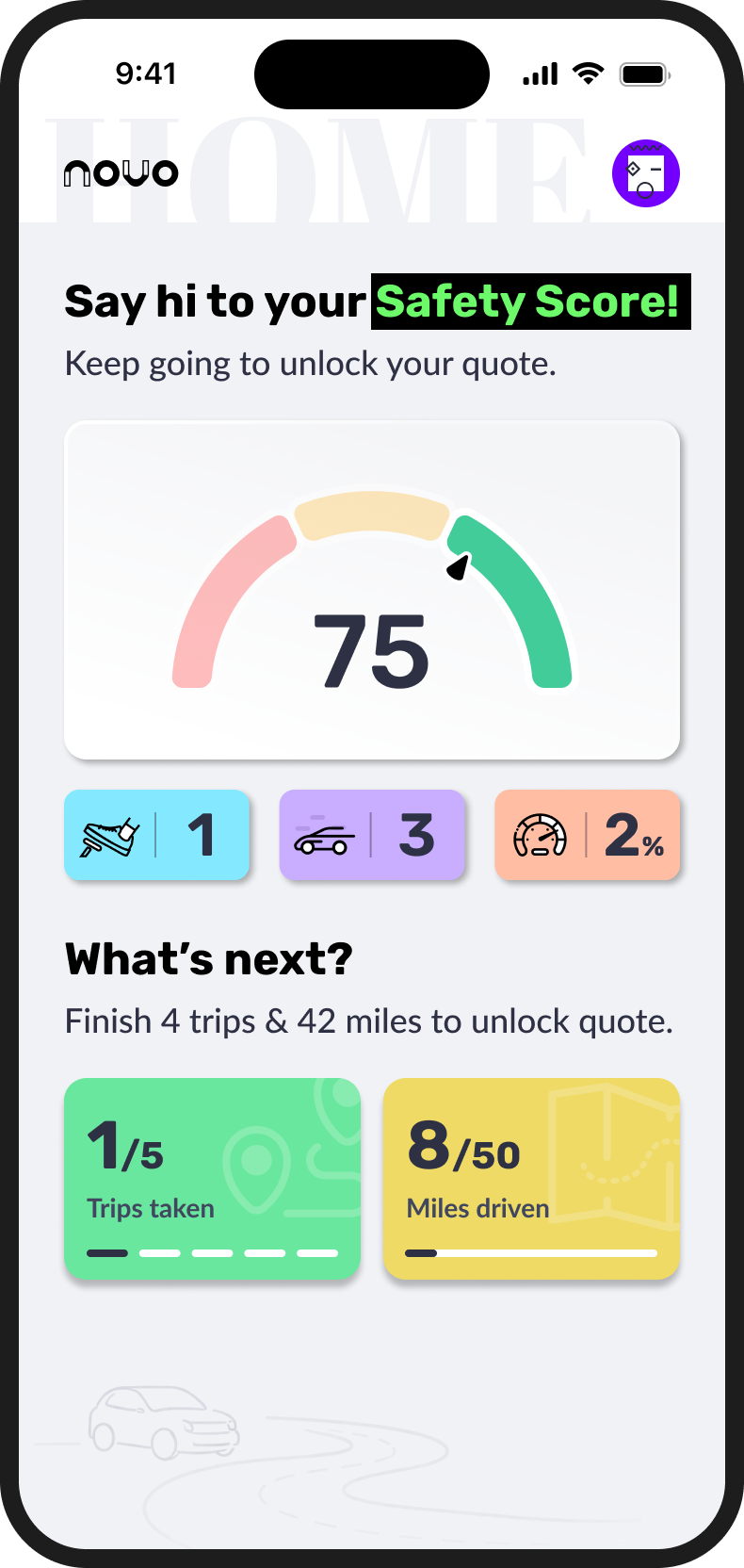
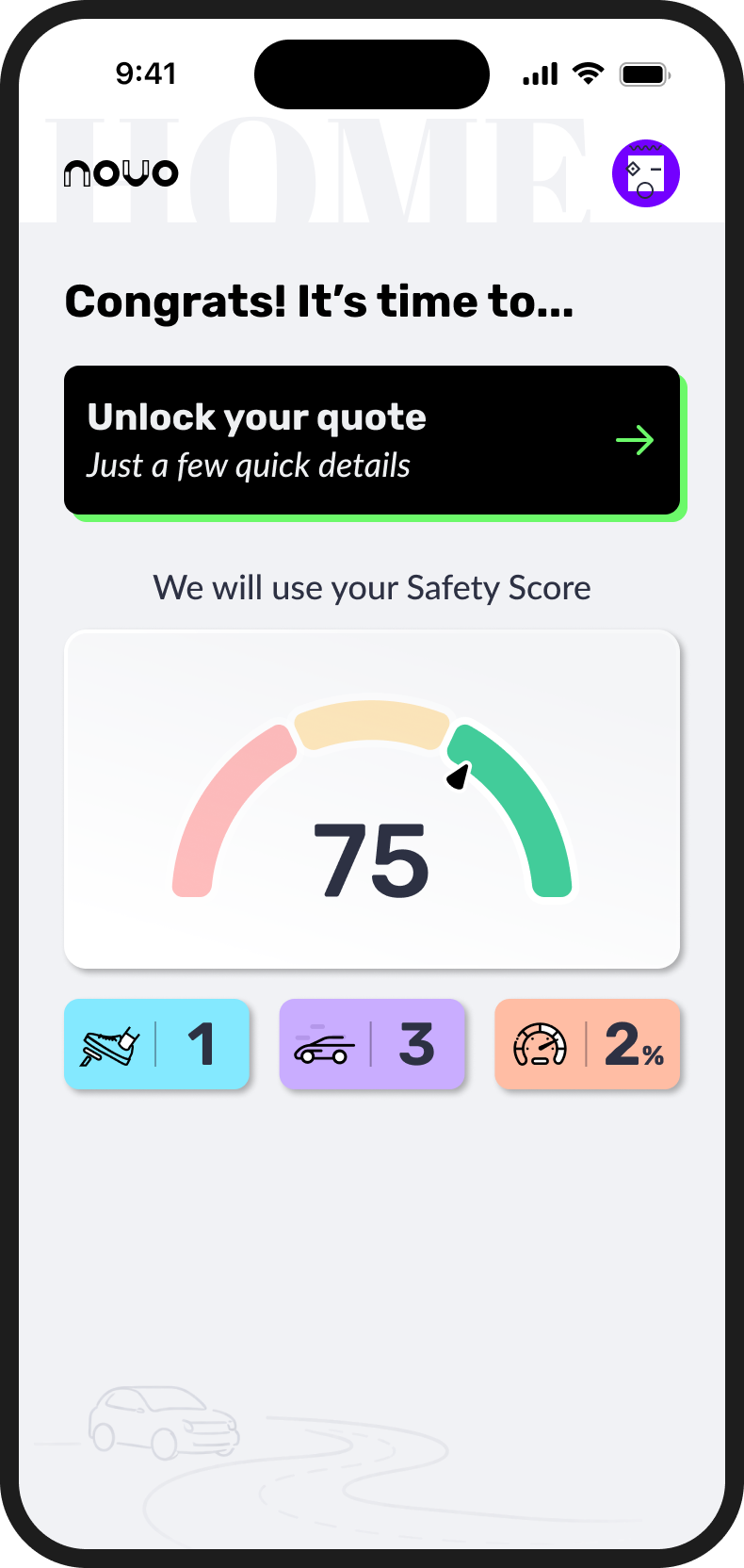
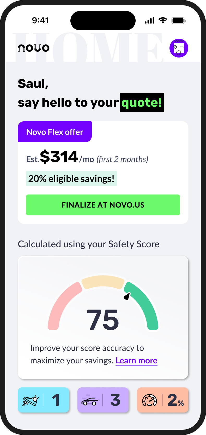
No policy required. Drive, get a safety score, see potential savings. Convert when ready.
You can't see the insurance product without being a policyholder. That makes the onboarding experience critical — drop out before completing setup, and the product doesn't exist for you.
02 — Key Screens
Two journeys,
side by side
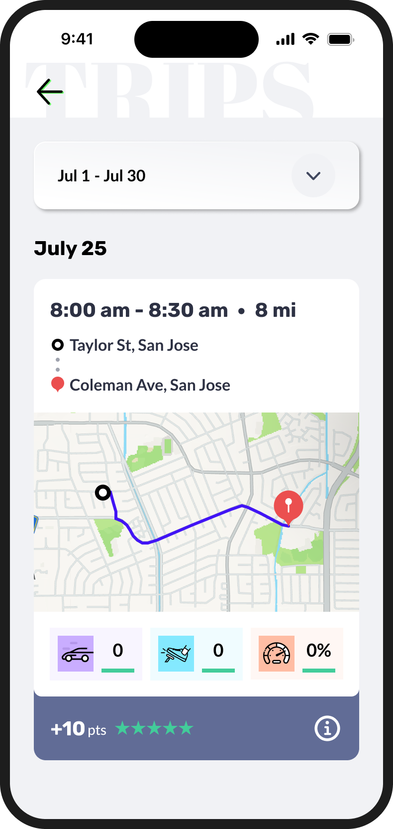
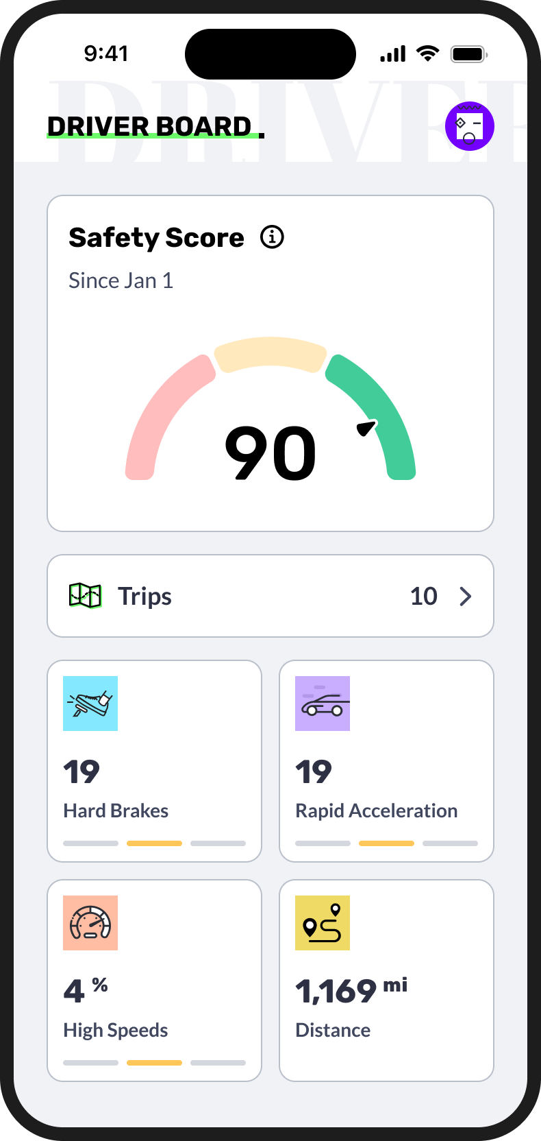
Welcome
With policy · one car
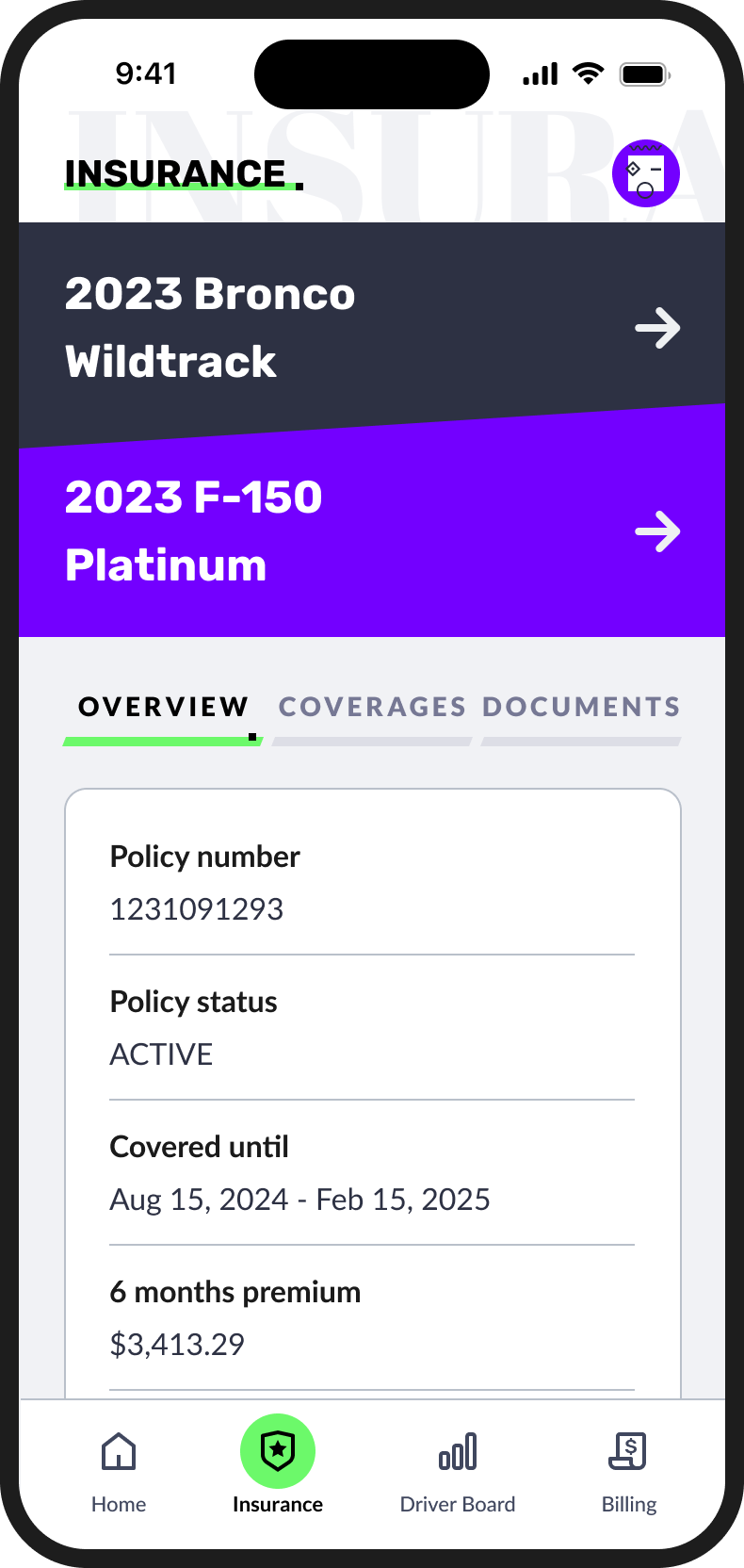
Insurance
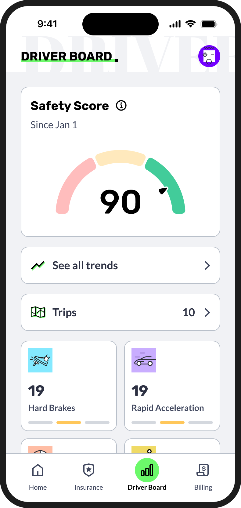
Driver Board
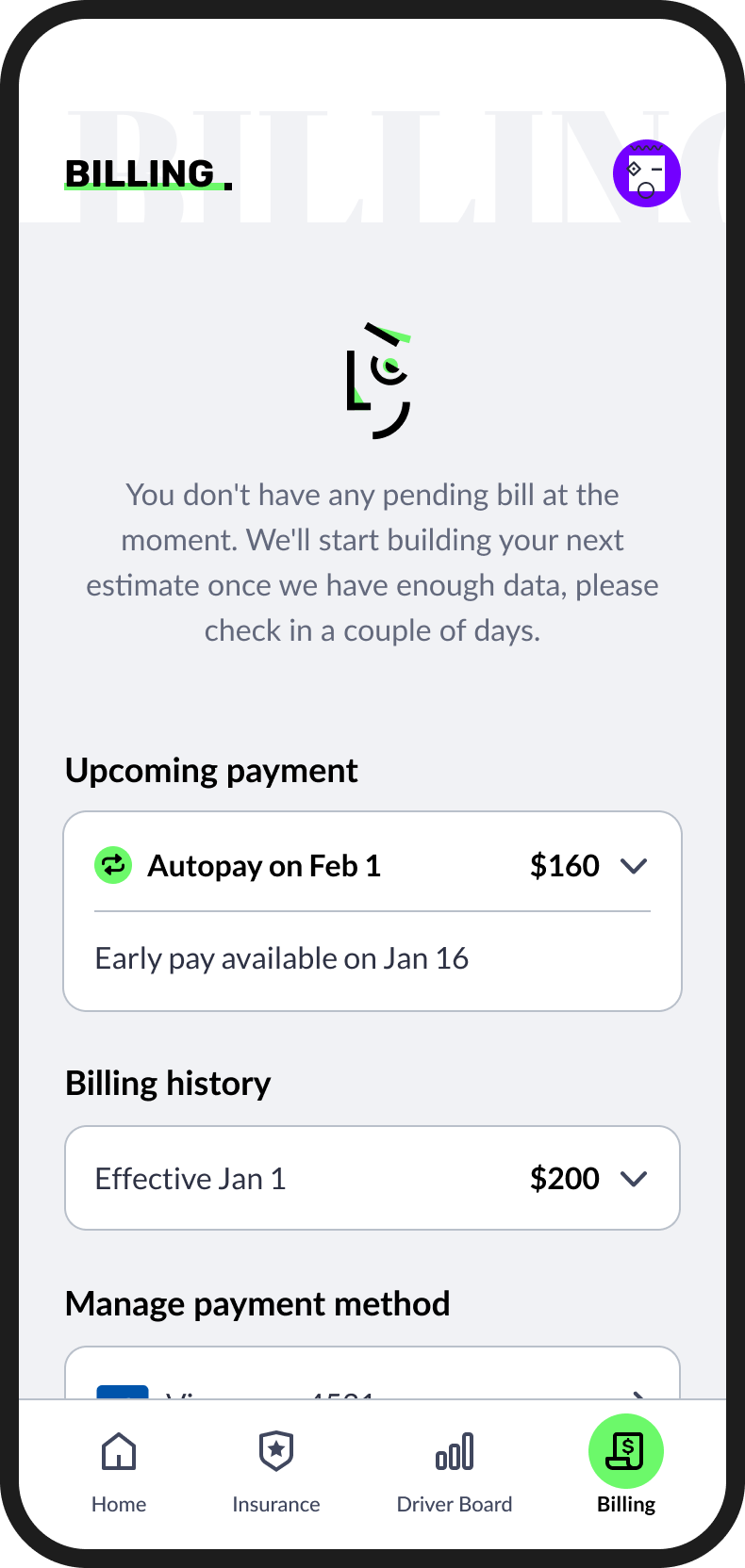
Billing

03 — The Problem
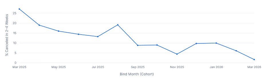
25% were leaving
in the first month
When policyholders signed up for Novo, a quarter of them cancelled within two to four weeks. Early churn at that scale had one clear cause: people weren't finishing setup. Uploading required documents, completing vehicle information, granting permissions — these steps were unclear, scattered, and easy to abandon.
Users who didn't complete setup couldn't access the product they were paying for. Users who couldn't access it left. The fix wasn't adding features — it was removing friction from the ones that already existed.
25% of new policyholders cancelled within 2–4 weeks. Incomplete setup was the common thread.
04 — Impact
What changed
after it shipped
05 — Document Upload
The feature
in action
Designed entirely by me. One of the features most directly tied to the churn reduction — making it easy for policyholders to submit required documents without dropping off.
06 — Reflection
What this work
actually taught me
The most interesting thing about this project is that the impact was real and measurable — which isn't always the case in product design. A 25% to under 5% churn reduction is the kind of number that shows up in board slides, and it came from making a document upload flow less confusing.
The feature that moved the needle wasn't a redesign of the scoring system or a new gamification mechanic. It was: can the user easily give us the documents we need, understand why, and feel confident it was done correctly? Getting that right required thinking carefully about the emotional state of someone who has just signed up for a new insurance product — motivated but uncertain, willing to comply but quick to give up if something feels broken.
The feature that moved the number wasn't the most exciting one on the roadmap. It was the one that removed the most confusion.