SafeStart is Novo’s test drive. It gave people a way to see what their own driving could mean for their price before deciding whether to buy a policy. This case study follows how we researched, designed, tested and improved that first experience.
01 — Context
I joined Novo as a UI designer while its product team was still taking shape. Novo had a brand and a website; one UI/UX designer was already on board, and another UX designer joined alongside me. Together, we helped develop the app around Novo’s approach to auto insurance: drivers receive a Safety Score based on how they drive, which helps determine their premium.
The app was serving policyholders, but Novo wasn’t attracting new customers as quickly as we’d hoped. That challenge led us to SafeStart: a way for people to experience Novo before deciding whether to buy a policy.
02 — The Room
Earlier customer sessions gave us a starting point: people had questions about location tracking, battery life, and how their data would be used. Once SafeStart was live, the two of us explored options in parallel and met with the executive team each day to review what we were seeing and decide what to try next.
Mixpanel showed where people dropped off and how A/B variants performed. Microsoft Clarity replays let us see where they hesitated or got stuck. We used both to guide the next iteration.
Each designer was the only designer on their version. Collaboration came second, once there were real options on the table.
03 — The Idea
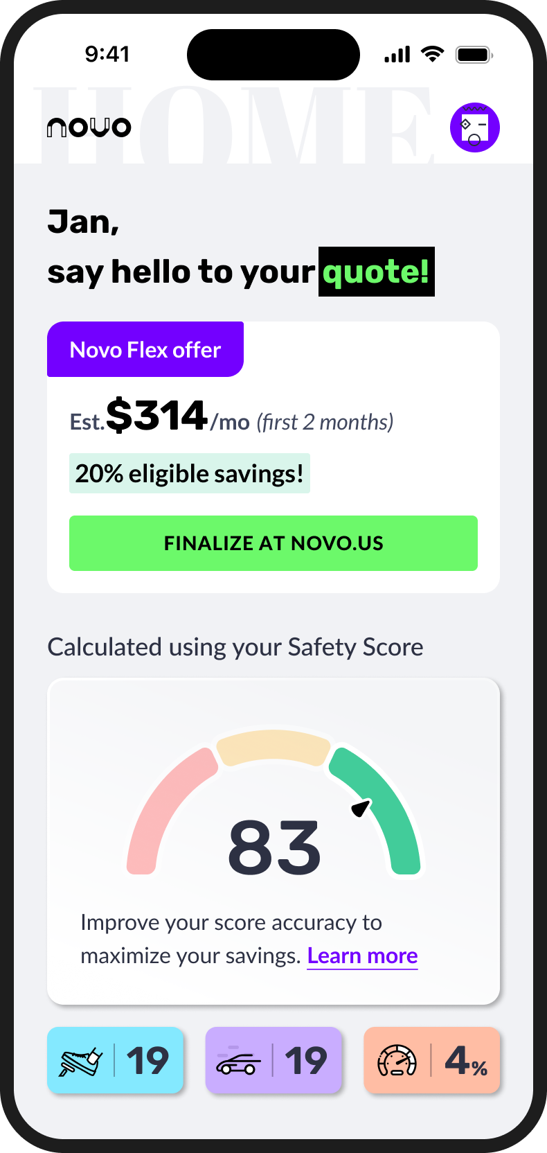
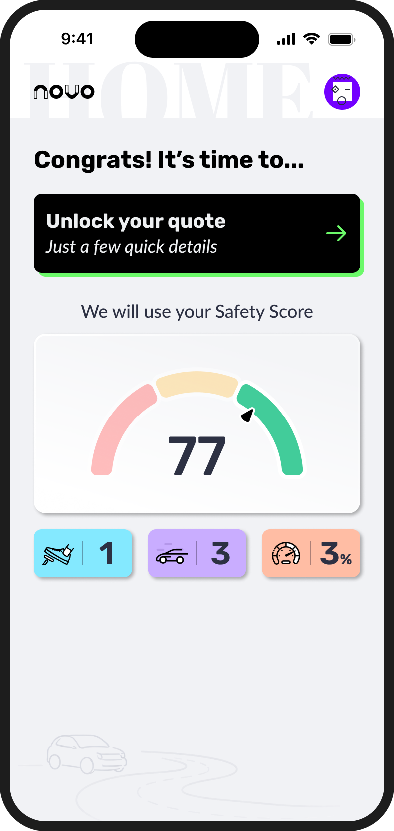
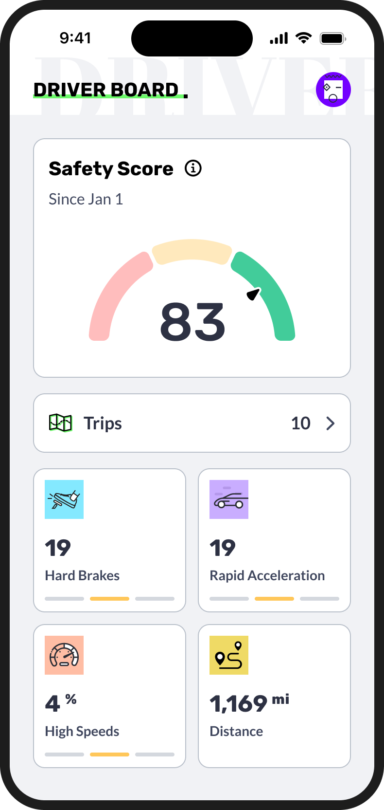
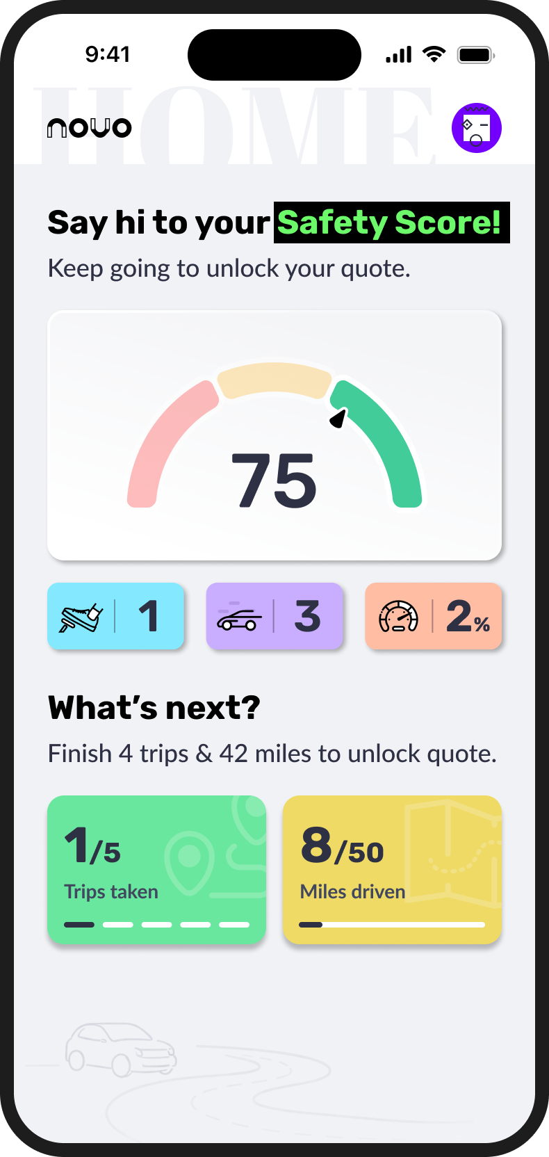
SafeStart let people get to know Novo through their own driving before deciding whether to buy a policy. After one trip, they will get their first Safety Score and coaching. After five trips and 50 miles, their quote and an estimated premium.
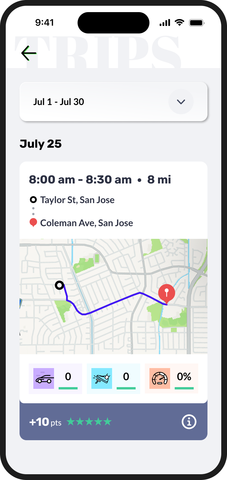
They could also see which driving behaviors shaped their score and price, and where they could improve. That gave them more to go on than a number alone when deciding if Novo was right for them.


04 — The Challenge
Before SafeStart could show someone a Safety Score, it had to record their drives. That meant asking for location access before people could see what the app would give them.
Only 5% selected “Always Allow.” Without that permission, SafeStart couldn’t record their trips, so most people never reached the score and estimated premium they had come to see.
Earlier customer sessions helped us understand the hesitation. People wanted to know whether Novo would track them all the time, drain their battery, or put their data at risk. We needed to answer those concerns before asking them to trust the app with their location.
selected “Always Allow”
Out of every 100 people, 5 chose “Always Allow.” For the other 95, SafeStart couldn’t record a trip.
05 — What We Learned
In earlier group sessions, customers asked whether Novo would track them outside of trips, drain their battery, or put their data at risk. Those questions showed us what people needed to understand before granting location access.
We used those concerns to make the setup clearer about what SafeStart offered, when it recorded trips, and why it needed location access.
06 — The Test
We tested two approaches to the permission step. One gave people detailed explanations of why Novo needed access. The other kept the message brief and showed the exact option to select, positioned almost where that option would appear in the system pop-up.
The shorter, more direct version performed better in Mixpanel. In Clarity replays, we saw people skip through the detailed explanations. They needed enough context to feel comfortable, followed by clear guidance when it was time to make a choice.
Enough context to feel comfortable, then clear guidance at the moment of choice.
A short reason for the request and a visual example of the option to select, aligned with the system pop-up.
More information about the permission and why Novo needed it.
07 — The Iterations
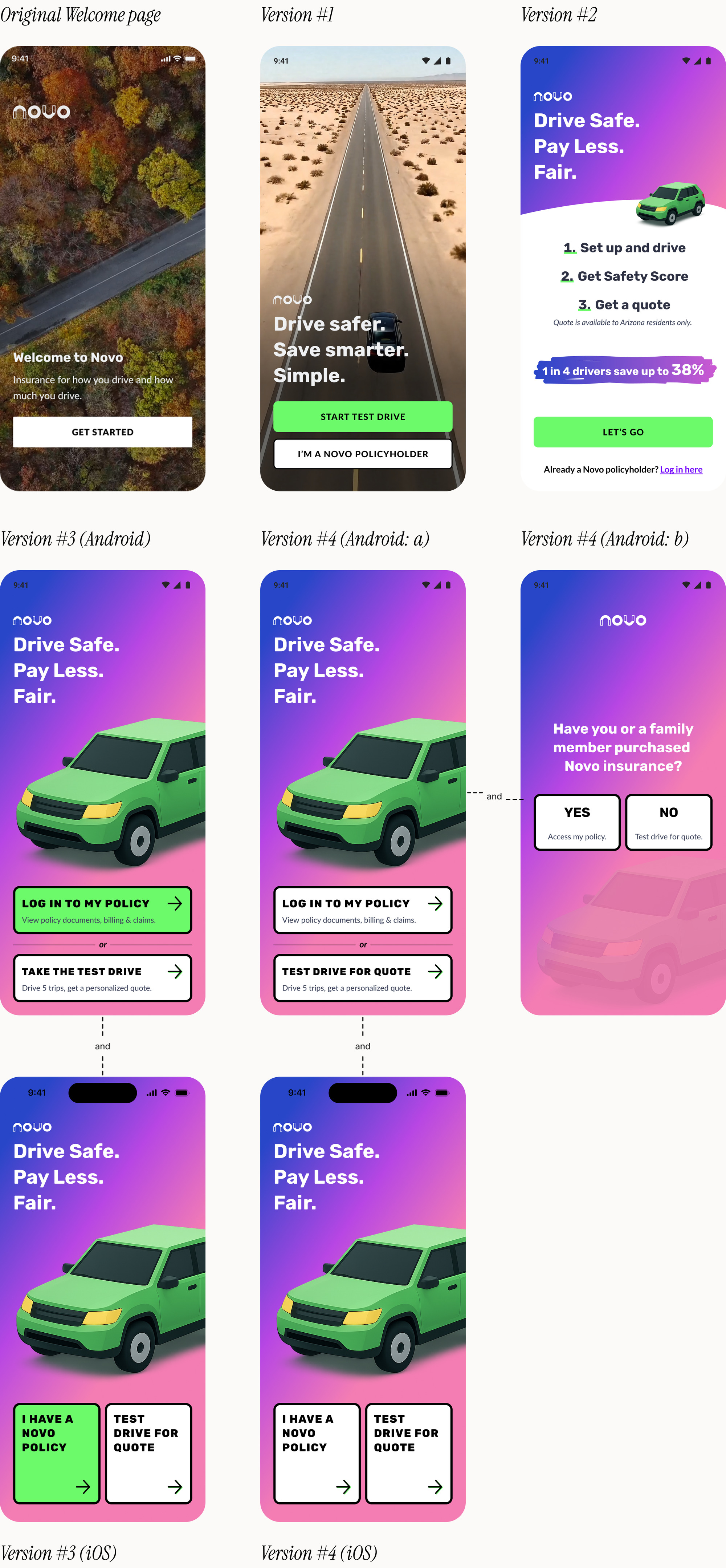
We worked through the journey from the first choice between policyholder and Test Drive, through login and setup. We tried different ways to introduce permissions, changed the copy and screen order, and used Mixpanel and Clarity to see where each version helped or created new friction.
Each morning, the two of us brought ideas and working prototypes to the executive team. We chose a direction together, worked through it with engineering, and sent build-ready screens, animations, and prototypes to the development team in China by the end of the day.
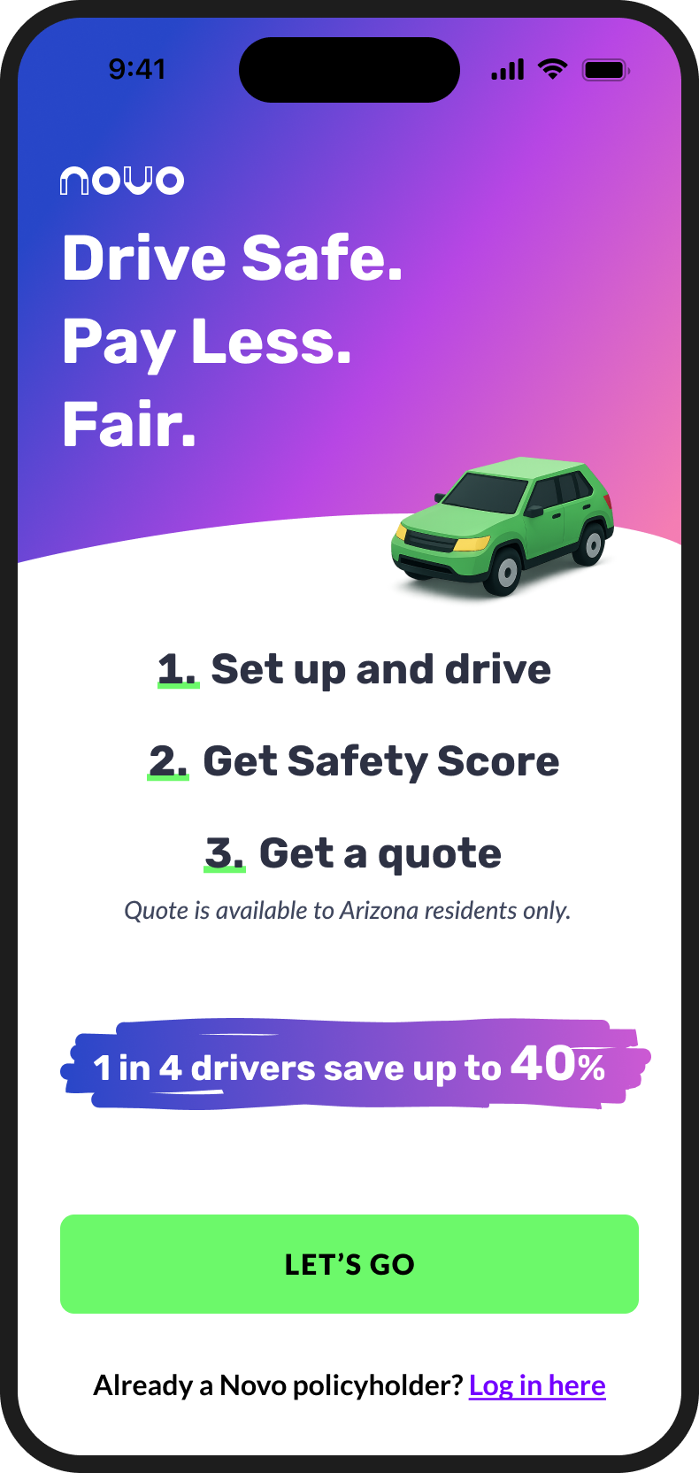
The welcome page below shows how the experience changed. Each version shipped.
This one put a community screen ahead of the location request: a live map of Arizona and what Novo drivers add up to together. Safe driving makes the road safer for everyone, and the screen gave people that reason before the app asked for anything.
It runs right here. Tap through to see the location request that follows. The figures in the prototype are sample data.
08 — Outcome
“Always Allow” location acceptance, up from 5%
Across the SafeStart iterations, the share of people choosing “Always Allow” for location rose from 5% to 16%. That gave more drivers the access needed for automatic trip recording.
09 — Reflection
SafeStart pushed us to look beyond whether a screen was clear in a design review. We listened to prospective customers, watched how people used the released flow, compared alternatives and changed course when a more detailed explanation performed worse.
For me, the work brought together product thinking and execution: shaping a new way into Novo, designing within the requirements of trip detection, and moving from insight to working design quickly.